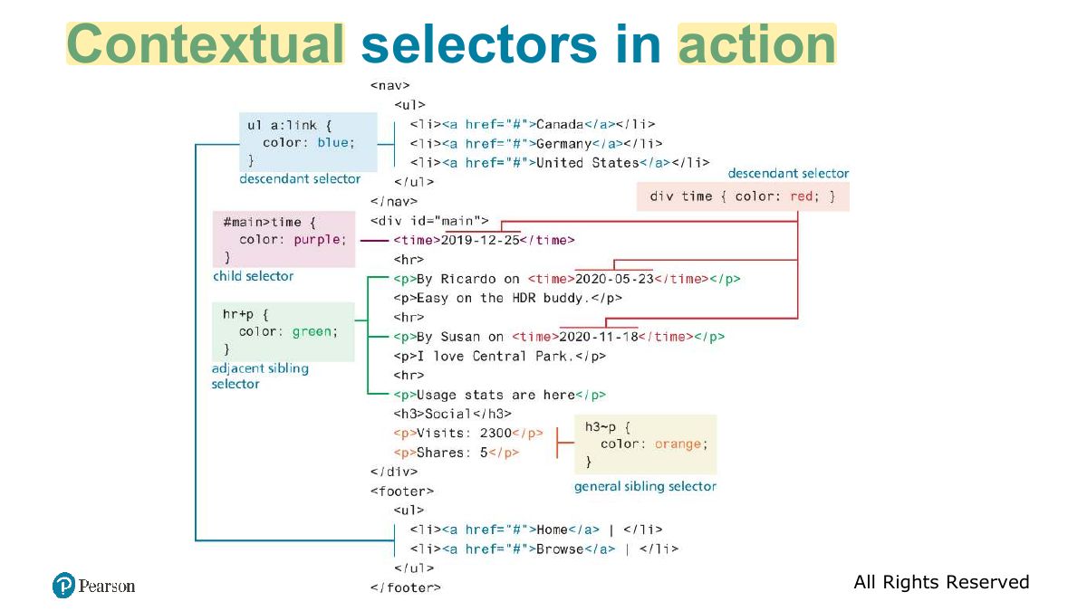
Which selector targets the element with id="main"?
CSS
CSS syntax and values, where styles go (inline, embedded, external), selectors (element, class, id, attribute, pseudo-class/element, contextual), the cascade (inheritance, specificity, location), block and inline elements, the box model, text styling, CSS variables, tables and forms, then Flexbox, Grid, and responsive design with viewports and media queries.
How to read this page
Every original slide is shown unchanged. Yellow marks on a slide point to a numbered note: hover or tap a mark to jump to its note, and hover a note to see its marks. Questions tagged Past exam appeared on a real paper; Prediction questions are likely angles, not confirmed. Pick an answer to each question: a wrong pick tells you why it is wrong, so you can try again.
All 85 slides
- 1 Fundamentals of Web Development
- 2 What Is CSS?
- 3 Benefits of CSS
- 4 CSS Syntax
- 5 CSS Syntax: Values
- 6 Color Values
- 7 Common Units of Measure Values
- 8 Location of Styles
- 9 Inline Styles
- 10 Embedded Style Sheet
- 11 External Style Sheet
- 12 Selectors
- 13 Element Selectors
- 14 Class and ID Selectors
- 15 Class and ID Selector Example
- 16 Attribute Selectors
- 17 Attribute Selectors
- 18 Attribute Selector Example
- 19 Pseudo-Element and Pseudo-Class Selectors
- 20 Common Pseudo-Class and Pseudo-Element Selectors
- 21 Styling a link using pseudo-class selectors
- 22 Syntax of a descendant selection
- 23 Task
- 24 Slide 24
- 25 Contextual Selectors
- 26 Contextual selectors in action
- 27 NEW! Nested CSS rules
- 28 The Cascade: How Styles Interact
- 29 The Cascade: Inheritance
- 30 The Cascade: Specificity
- 31 Simplified Specificity algorithm
- 32 The Cascade: Location
- 33 Block Elements
- 34 Inline Elements
- 35 Inline Element Example
- 36 Block and inline elements together
- 37 Margins and Padding
- 38 The Box Model
- 39 Box Model: All or one
- 40 Box Dimensions
- 41 Overflow Property
- 42 Box sizing via percent
- 43 CSS Text Styling
- 44 Font Family
- 45 Different font families
- 46 @import a font available online
- 47 Slide 47
- 48 Font Sizes
- 49 Font Weight
- 50 Text properties
- 51 CSS Variables
- 52 Example Part 1 (duplicate values)
- 53 Example Part 2 (CSS variables)
- 54 Styling Tables (Borders)
- 55 Styling table borders
- 56 Boxes and Zebras
- 57 Boxes and Zebras (ii)
- 58 Styling Form Elements
- 59 Working with labels
- 60 Form Design
- 61 Fundamentals of Web Development
- 62 In this chapter you will learn . . .
- 63 Flexbox Layout (for 1D layouts)
- 64 Flex containers and items
- 65 The flexbox container properties
- 66 The flexbox container properties (ii)
- 67 The flexbox item (child) properties
- 68 Grid Layout (for 2D layouts)
- 69 Specifying Grid Structure
- 70 Specifying column widths
- 71 Specifying column widths (ii)
- 72 Explicit Grid Placement Example 1
- 73 Explicit Grid Placement Example 2
- 74 Cell properties
- 75 Nested Grid
- 76 Grid Named Areas
- 77 Grid Areas (ii)
- 78 Grid and Flexbox Together
- 79 Responsive Design
- 80 Viewports
- 81 Setting Viewports
- 82 Media Queries
- 83 Media queries in action
- 84 The <picture> element
- 85 Supporting Material
Fundamentals of Web Development
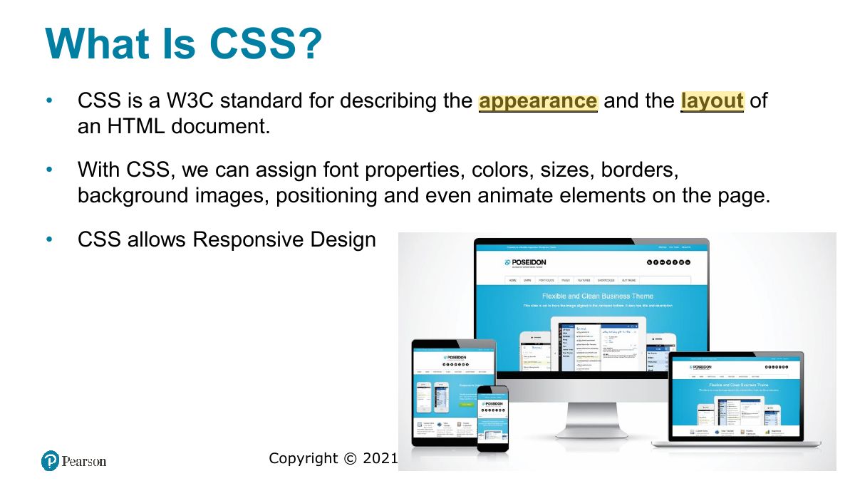
What Is CSS?
Benefits of CSS
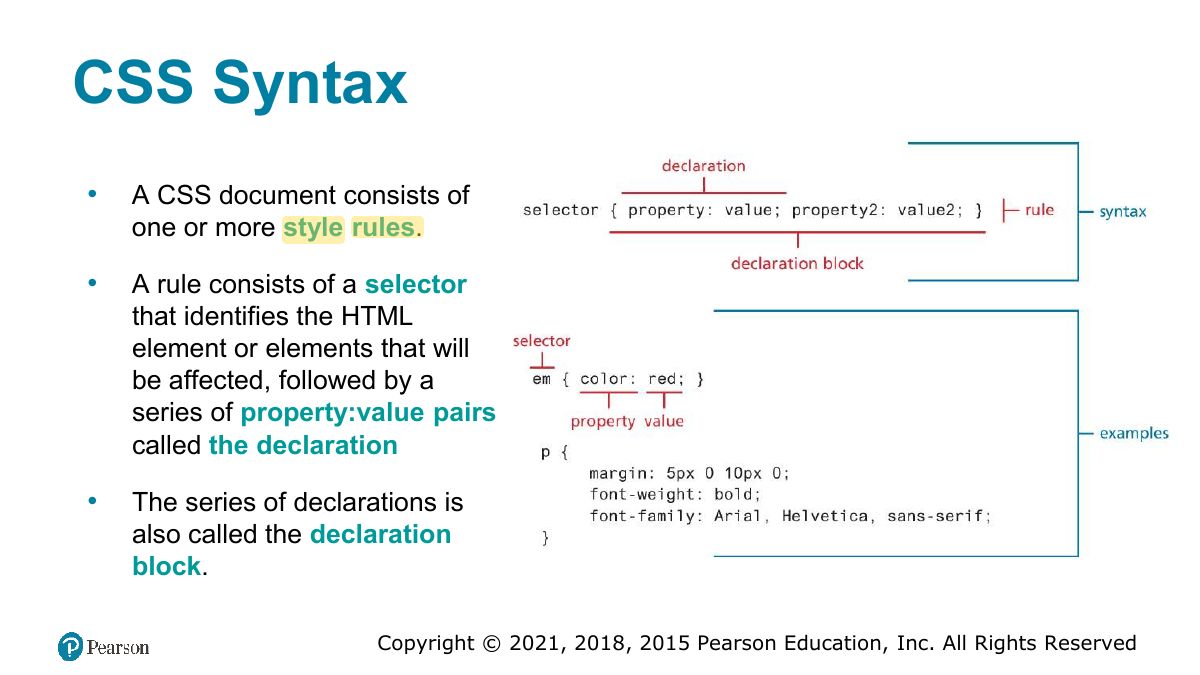
CSS Syntax
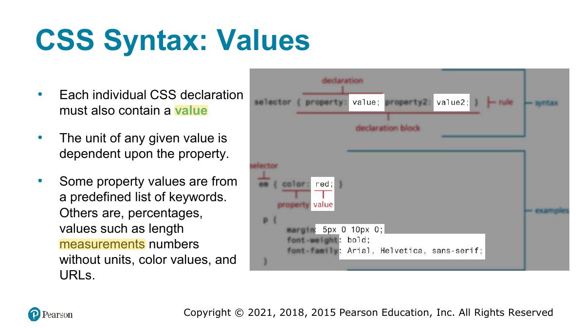
CSS Syntax: Values
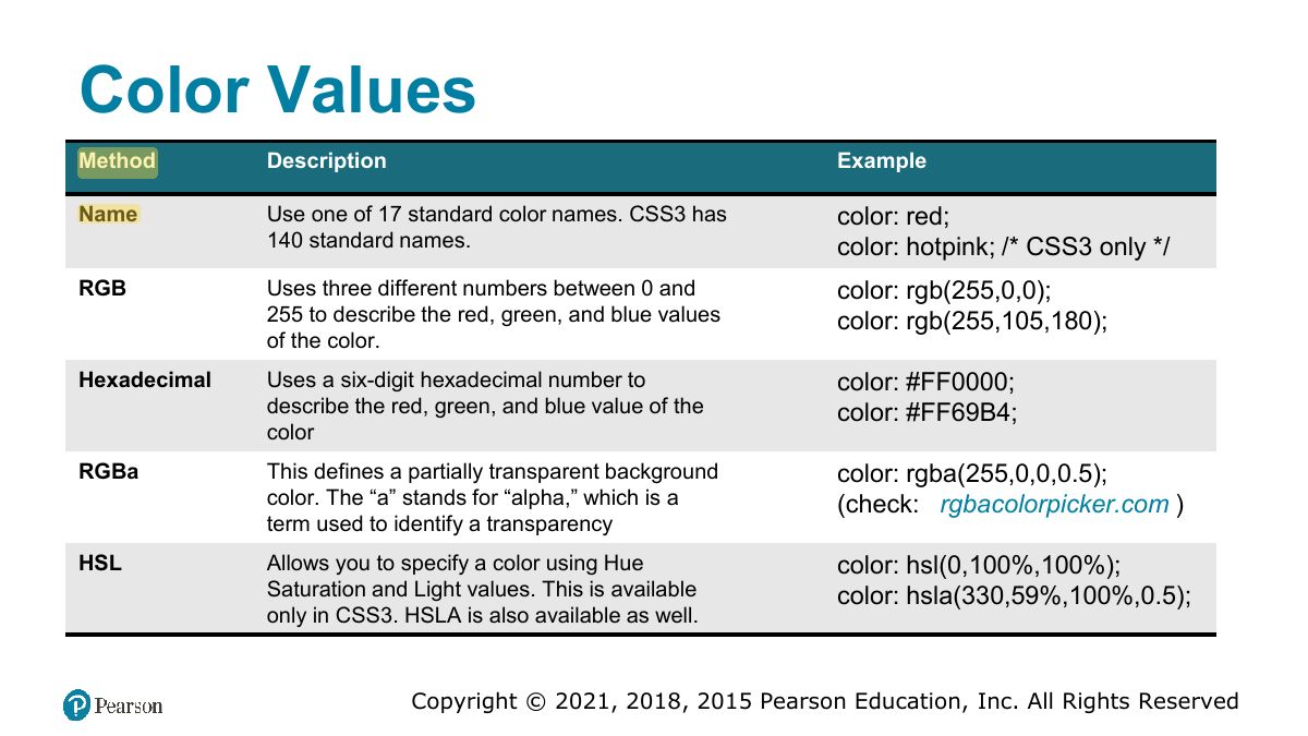
Color Values
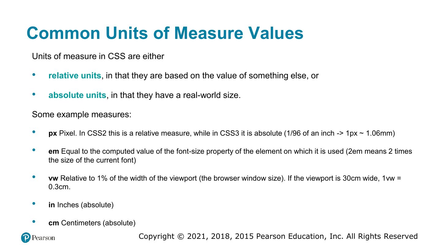
Common Units of Measure Values
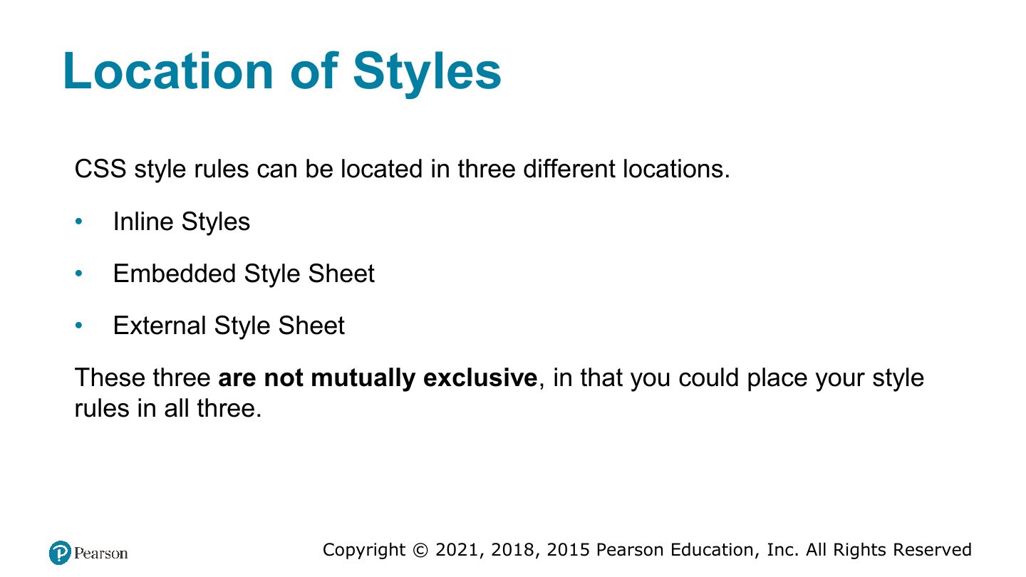
Location of Styles
Notes
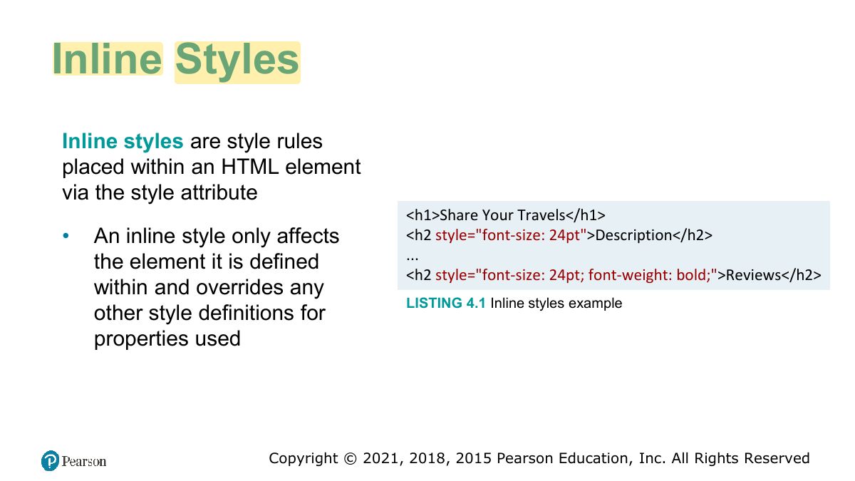
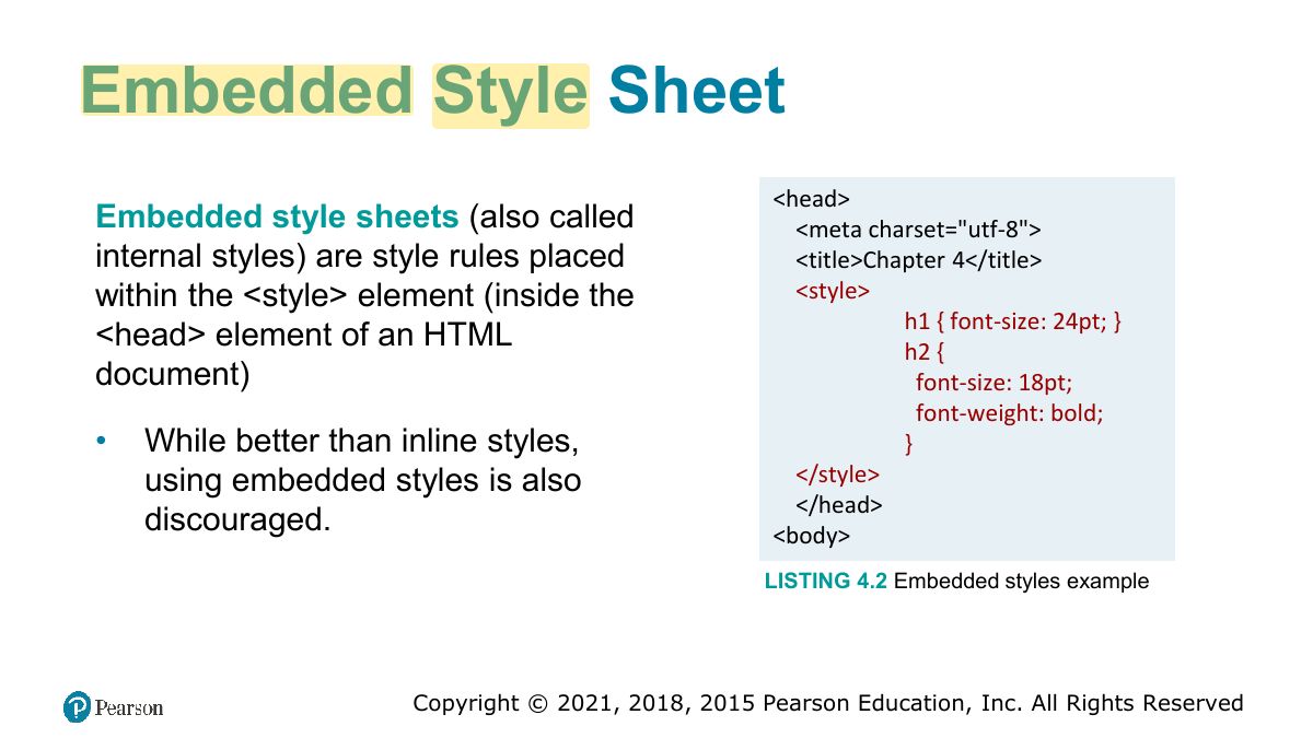
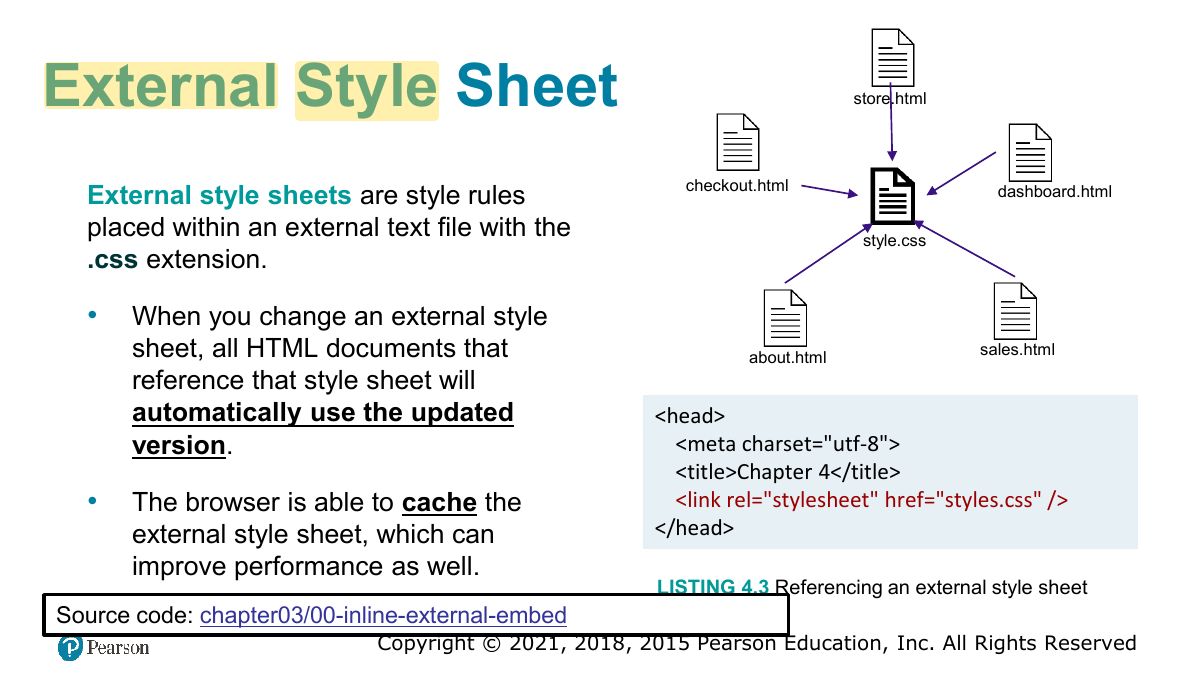
Locations: inline (style attribute), embedded (<style> in head), external (.css file via <link>). External is best for reuse.
Inline Styles
Embedded Style Sheet
External Style Sheet
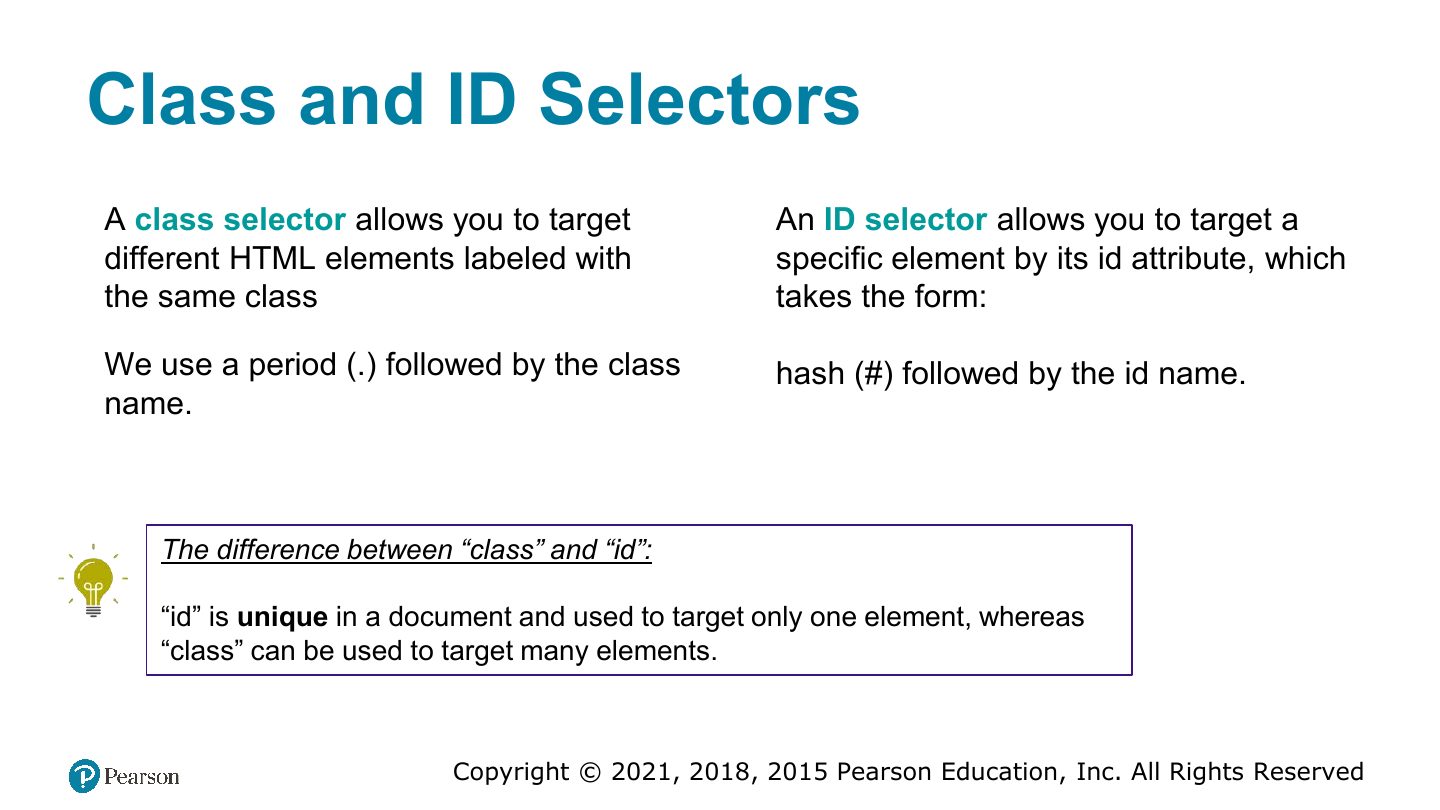
Selectors
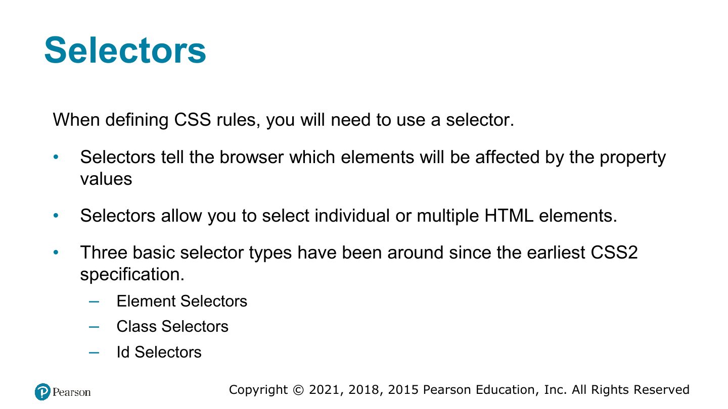
Element Selectors
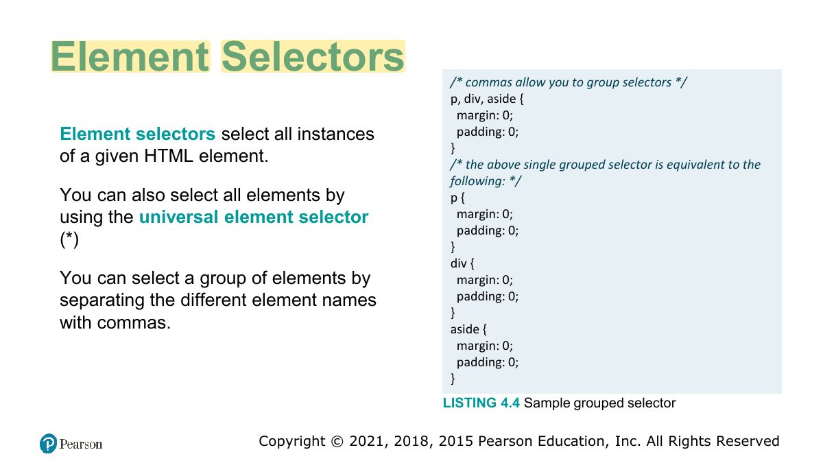
Class and ID Selectors
Exam angle
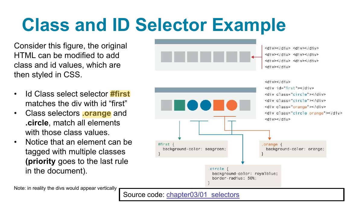
Class and ID Selector Example
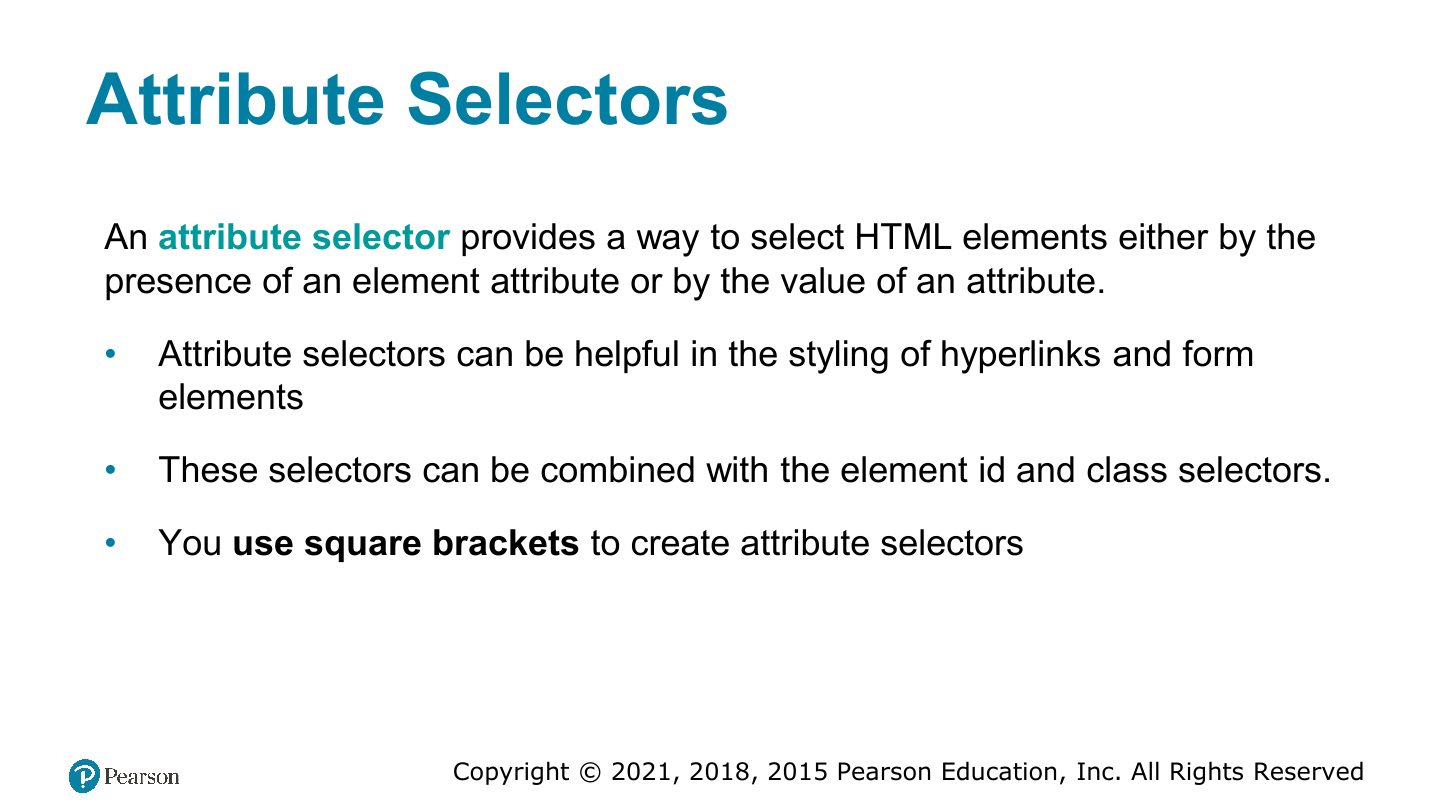
Attribute Selectors
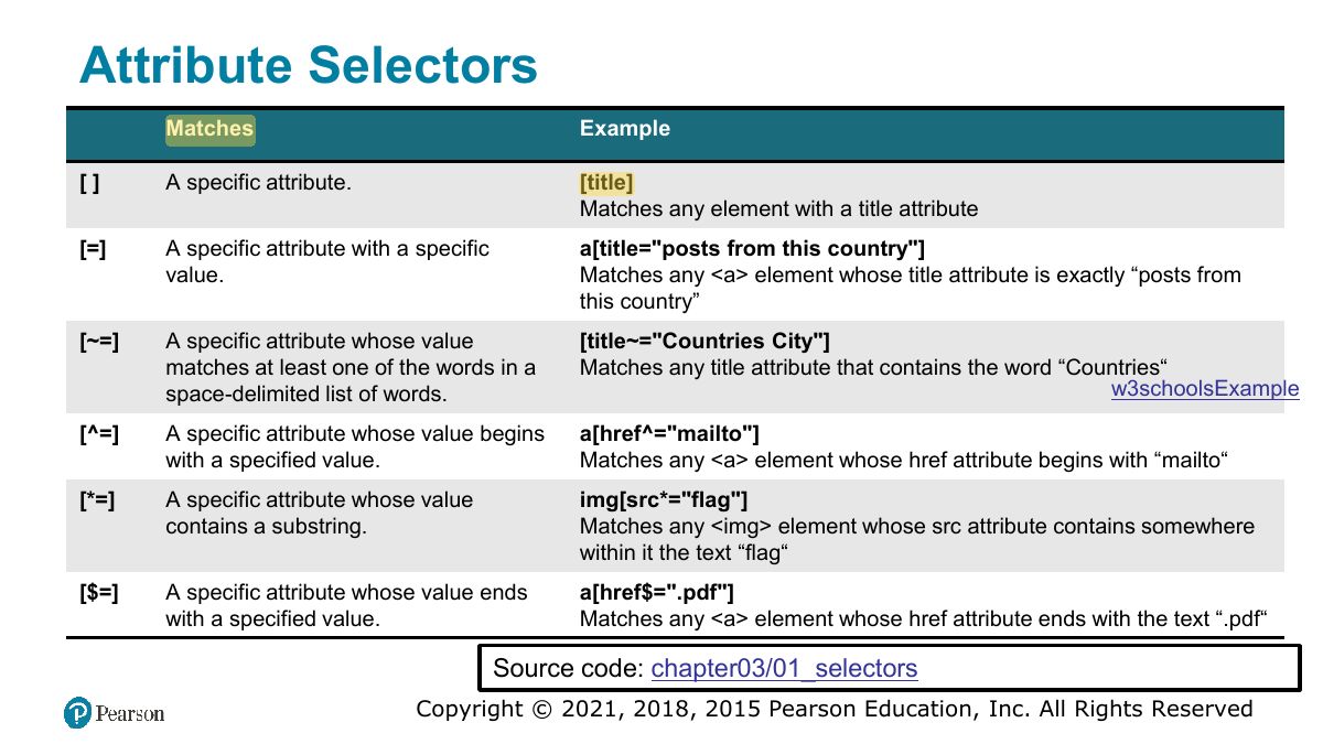
Attribute Selectors
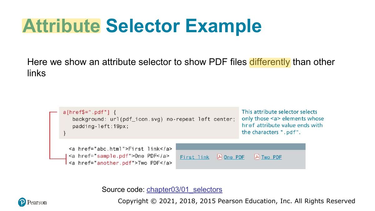
Attribute Selector Example
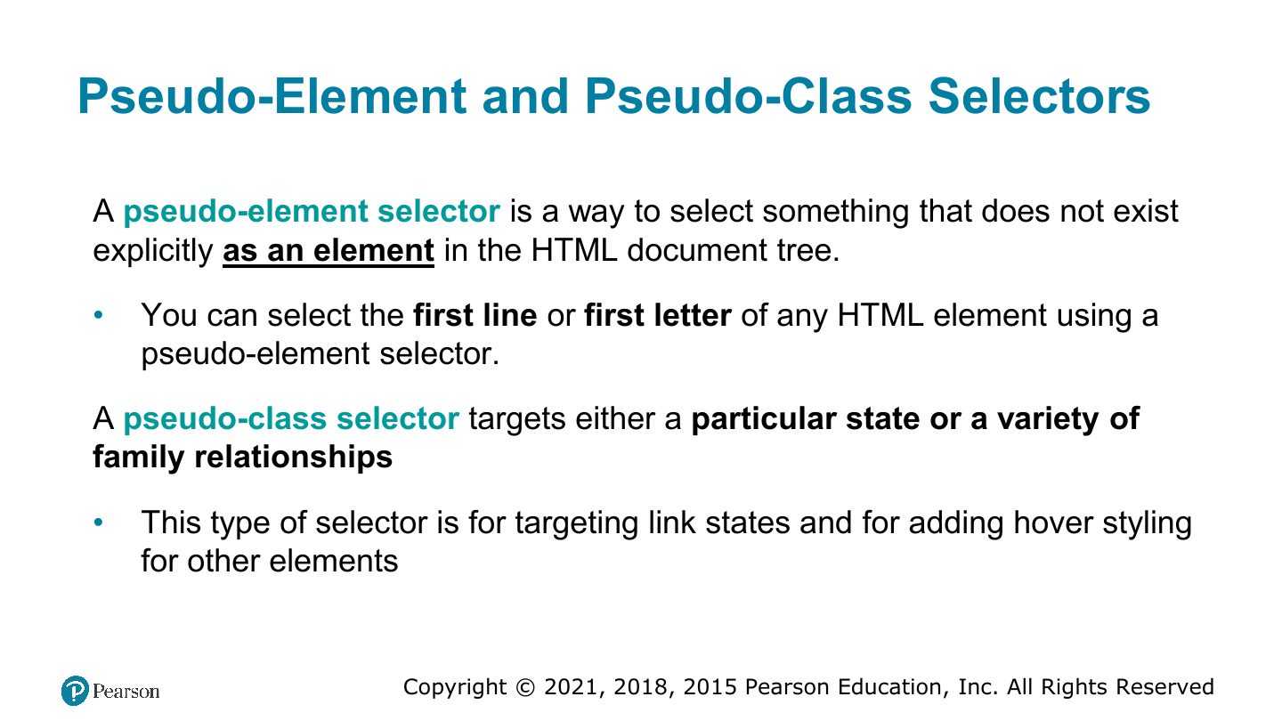
Pseudo-Element and Pseudo-Class Selectors
Notes
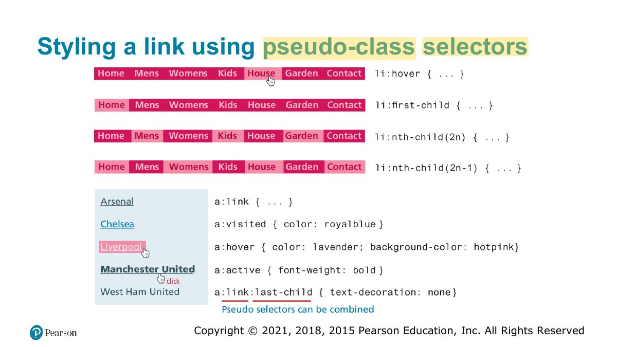
Pseudo-classes describe a state (:hover, :visited, :first-child); pseudo-elements a part (::first-line, ::before).
Common Pseudo-Class and Pseudo-Element Selectors
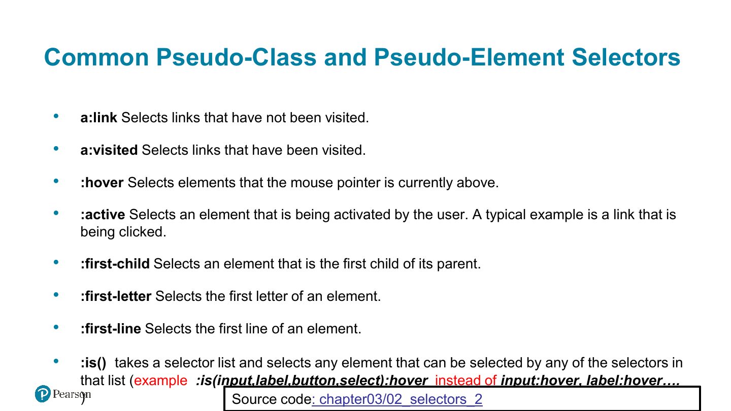
Styling a link using pseudo-class selectors
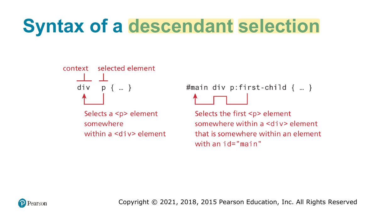
Syntax of a descendant selection
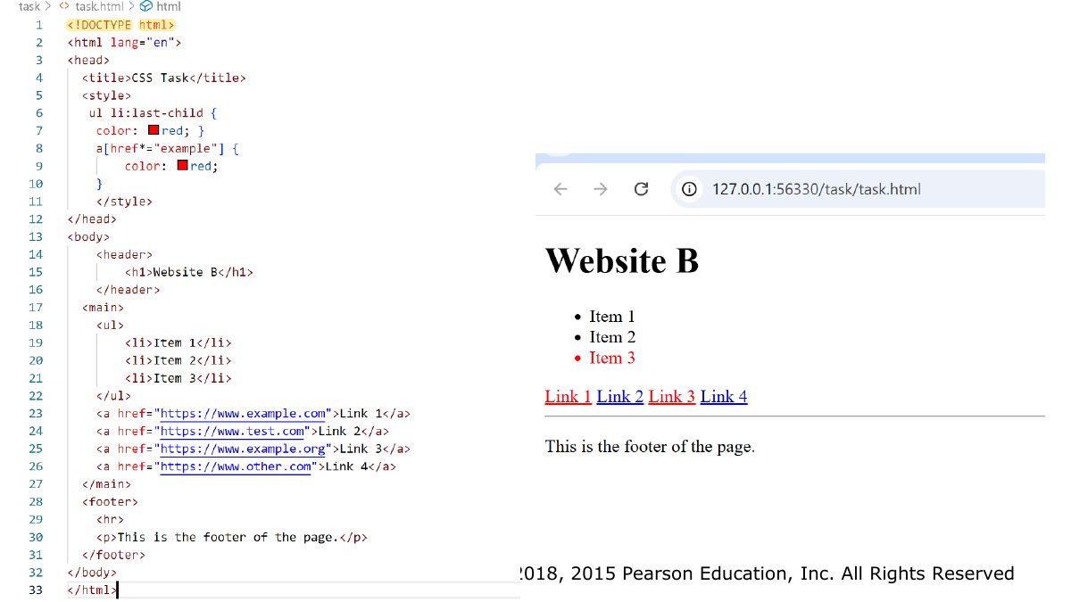
Task
Slide 24
Contextual Selectors
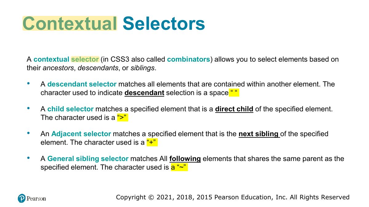
Exam angle
"ul > li" selects:
Contextual selectors in action
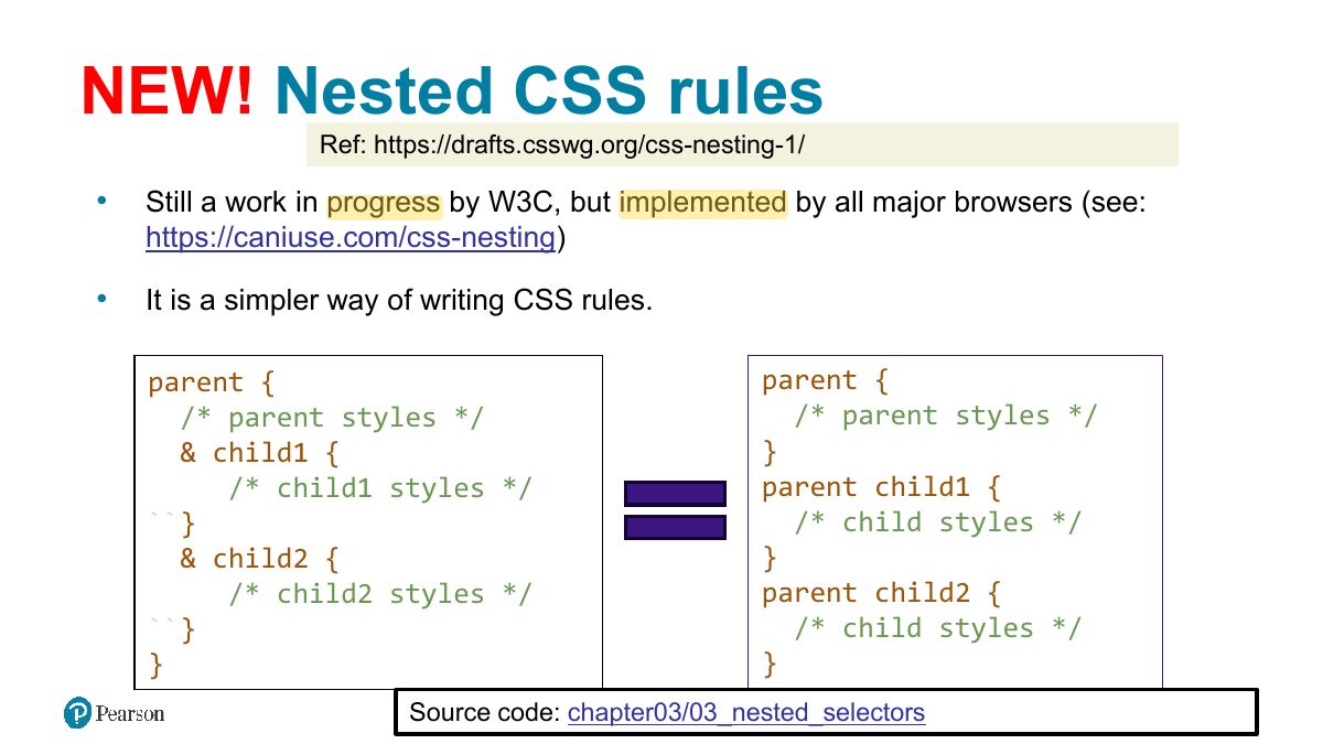
NEW! Nested CSS rules
The Cascade: How Styles Interact
Notes
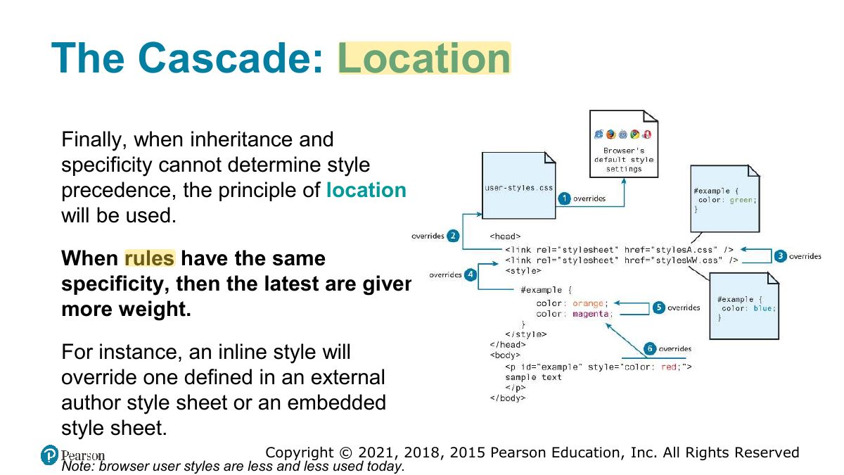
The cascade resolves conflicts by inheritance, specificity, then location (later rules win).
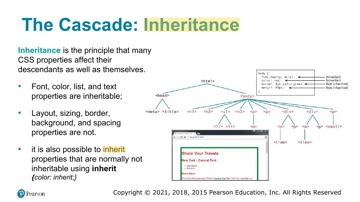
The Cascade: Inheritance
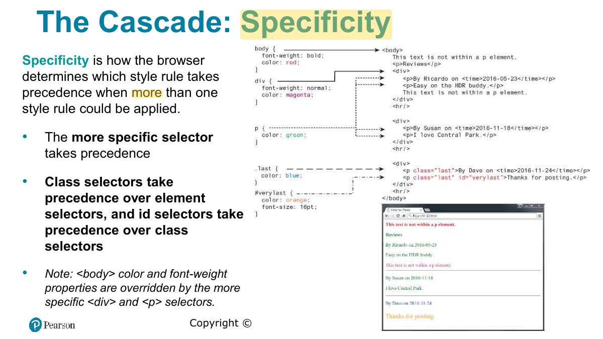
The Cascade: Specificity
Notes
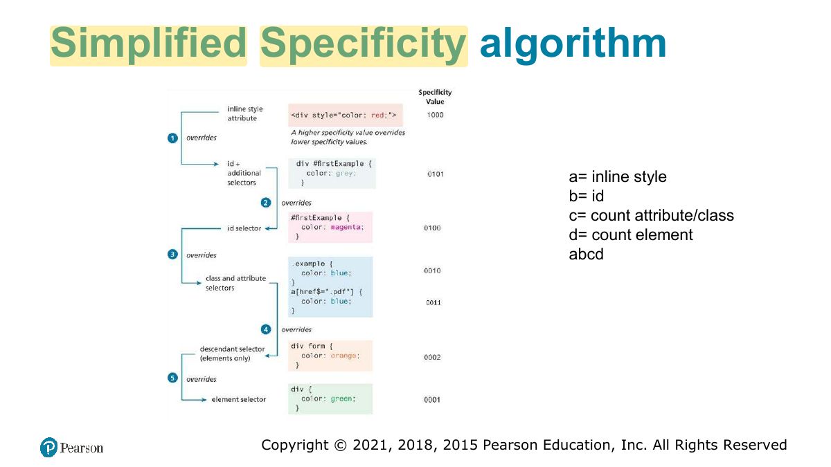
Specificity: inline style > id > class/attribute/pseudo-class > element. !important overrides.
Memory trick Count (ids, classes, elements): #nav .item a = (1, 1, 1) beats .nav .item a = (0, 2, 1).
Exam angle
Which wins: "#title { color: red }" or ".heading { color: blue }" on the same element?
- An id beats a class regardless of order.
Simplified Specificity algorithm
The Cascade: Location
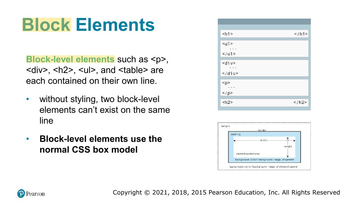
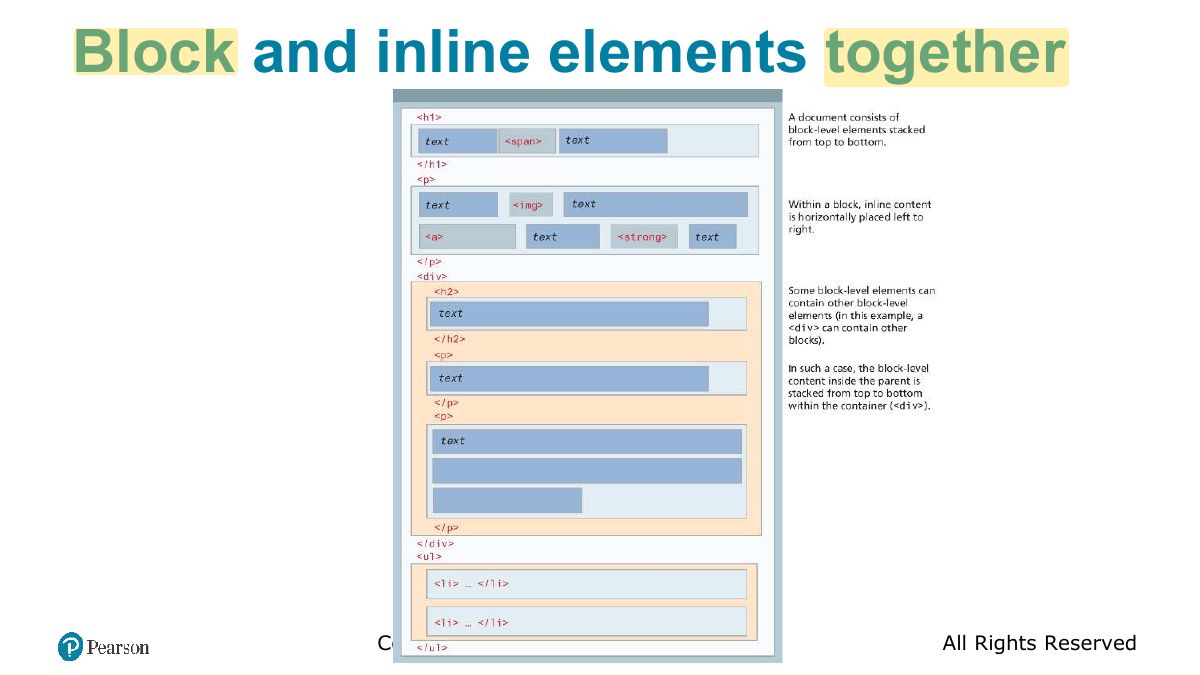
Block Elements
Notes
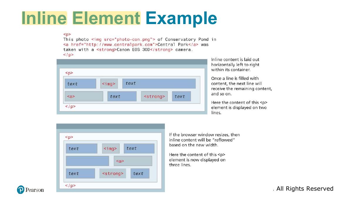
Block elements start on a new line and fill the width (div, p, h1). Inline elements flow within text (span, a, img).
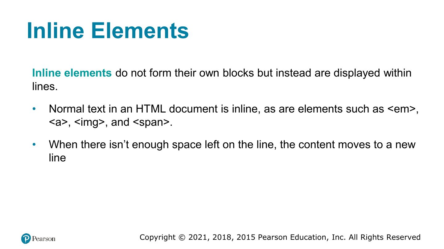
Inline Elements
Inline Element Example
Block and inline elements together
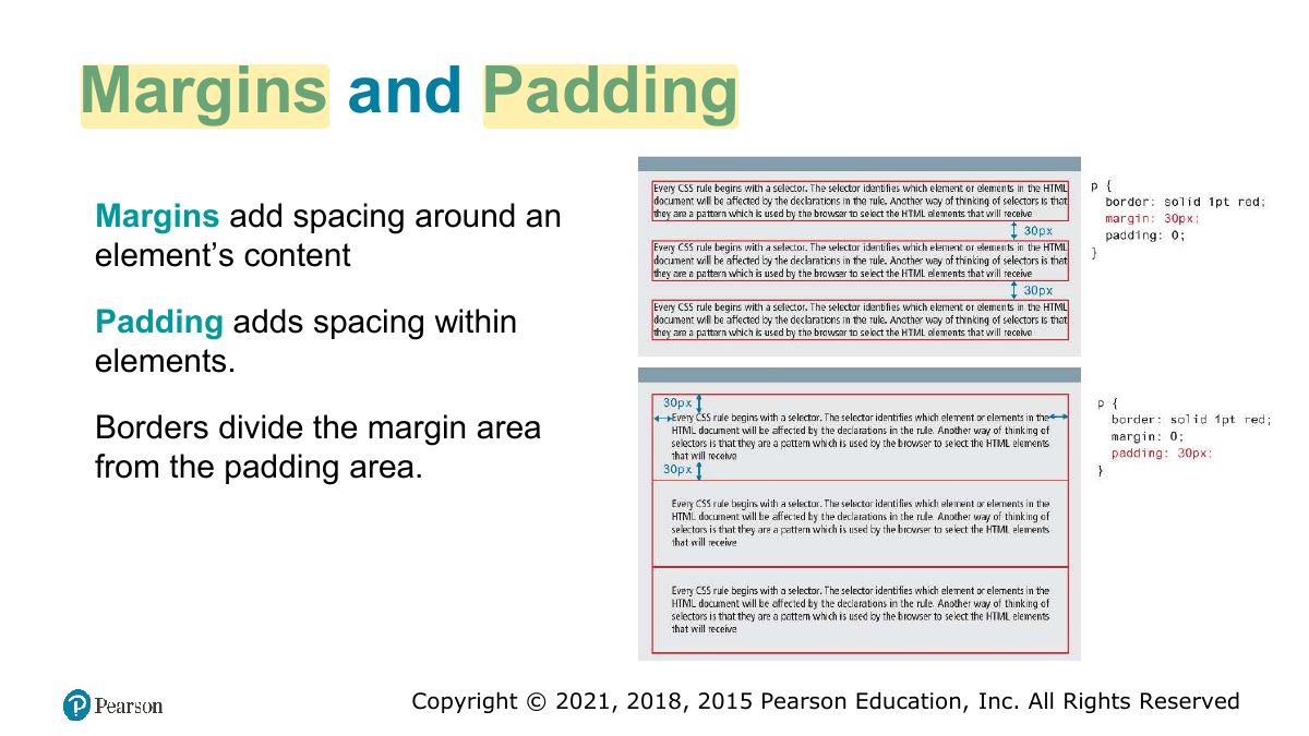
Margins and Padding
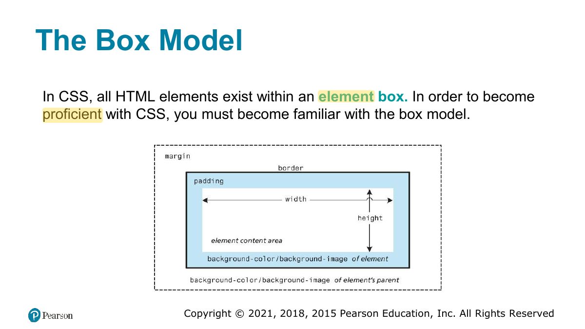
The Box Model
Notes
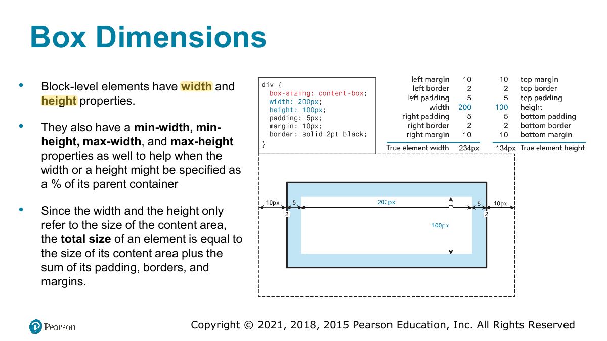
Box model: content → padding → border → margin. With box-sizing: content-box, width excludes padding and border; border-box includes them.
Exam angle
width: 200px; padding: 10px; border: 5px; (content-box). Total rendered width:
- 200 + 2×10 + 2×5.
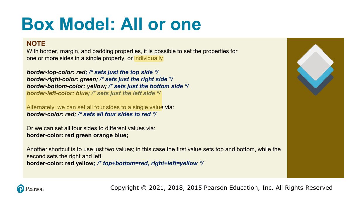
Box Model: All or one
Box Dimensions
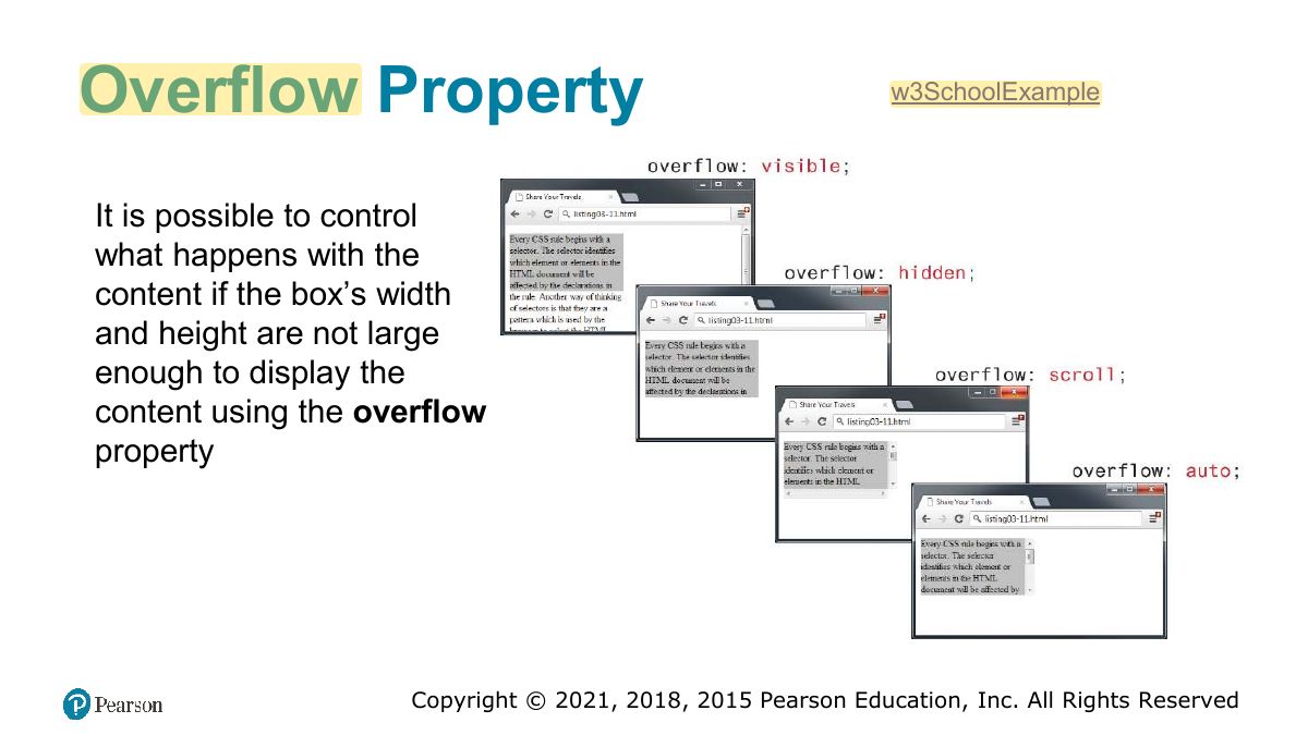
Overflow Property
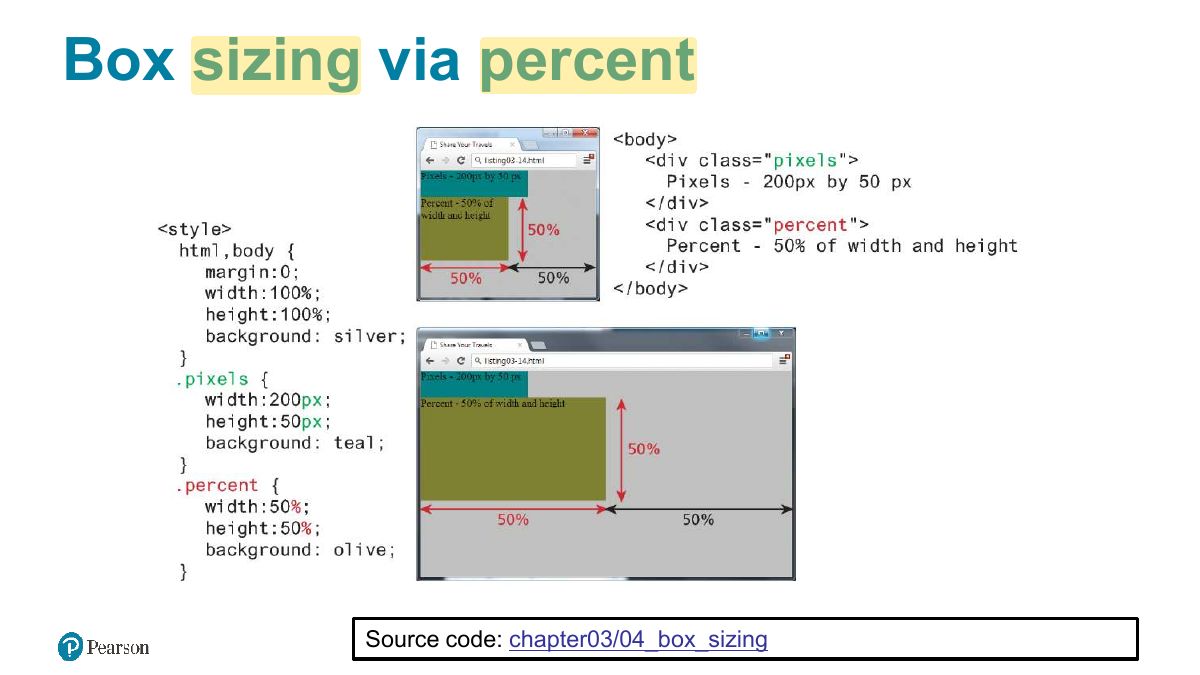
Box sizing via percent
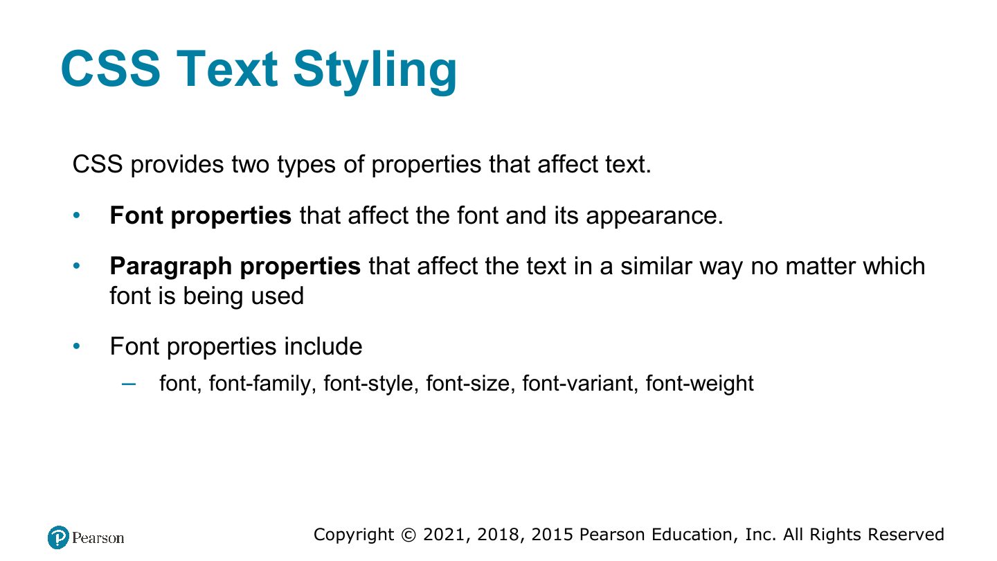
CSS Text Styling
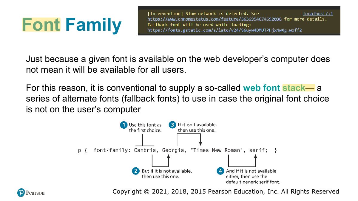
Font Family
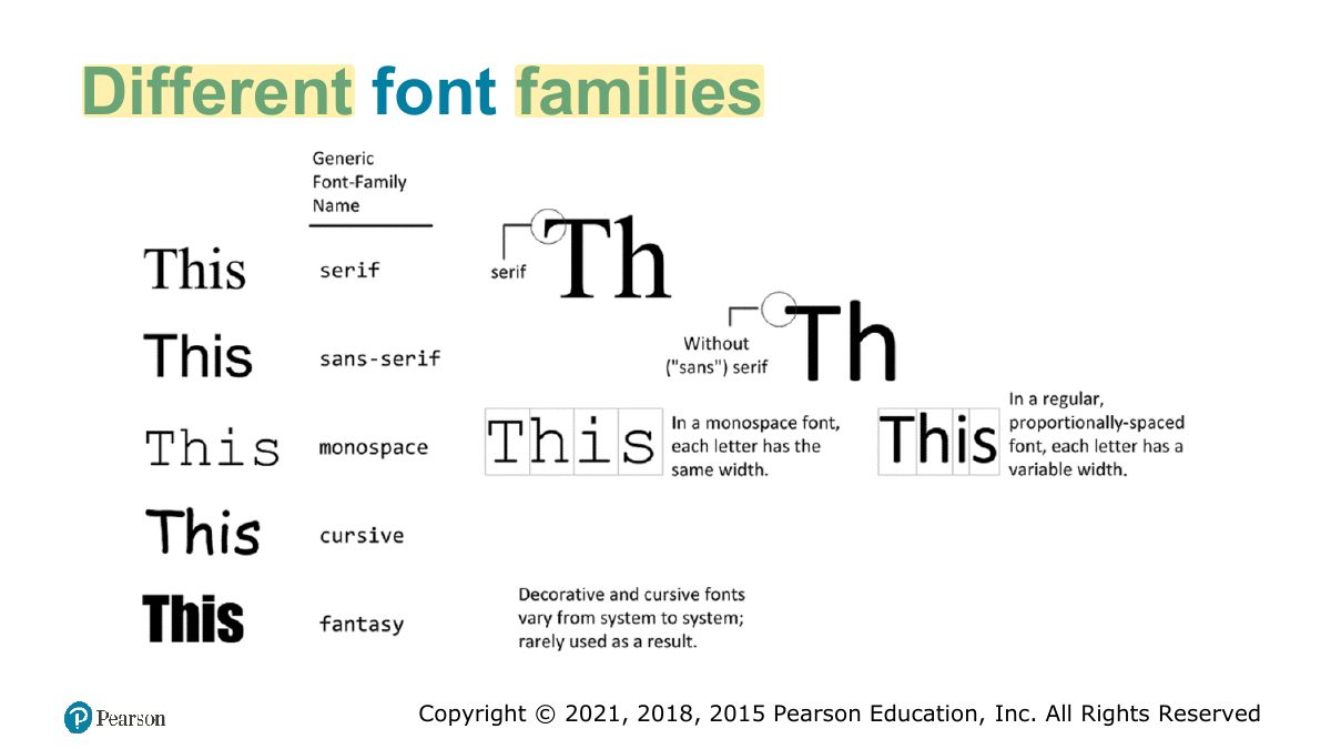
Different font families
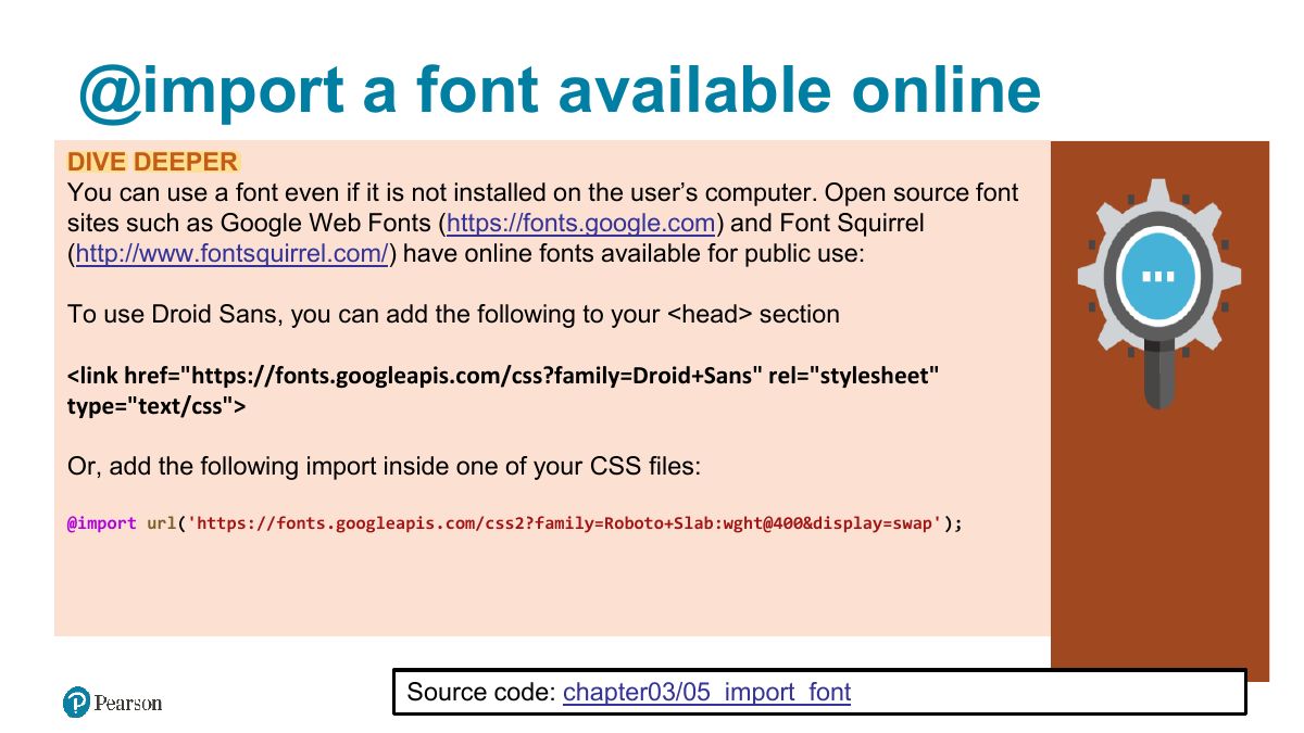
@import a font available online
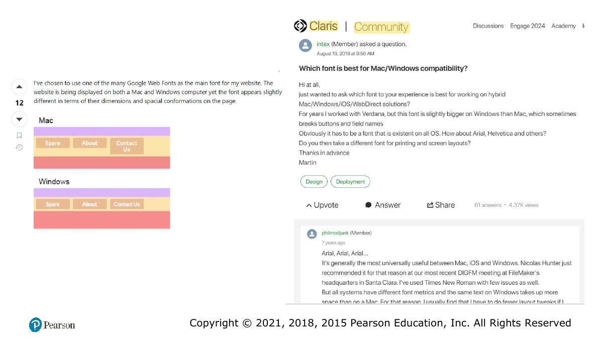
Slide 47
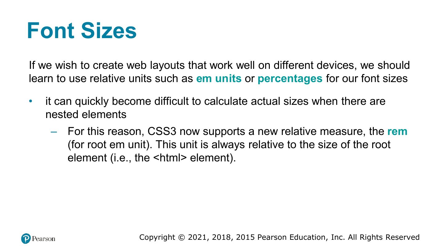
Font Sizes
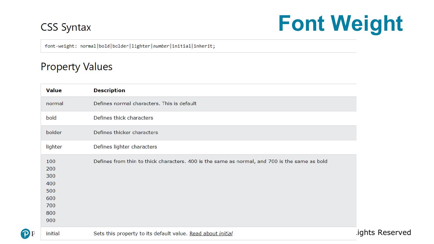
Font Weight
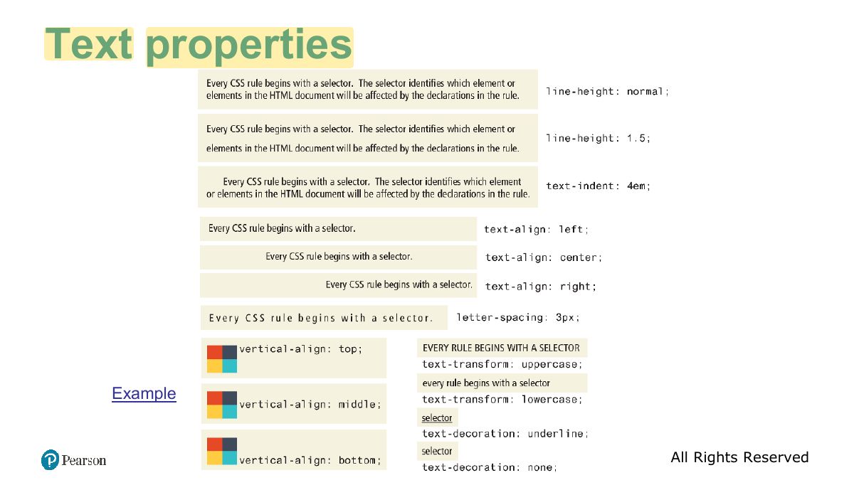
Text properties
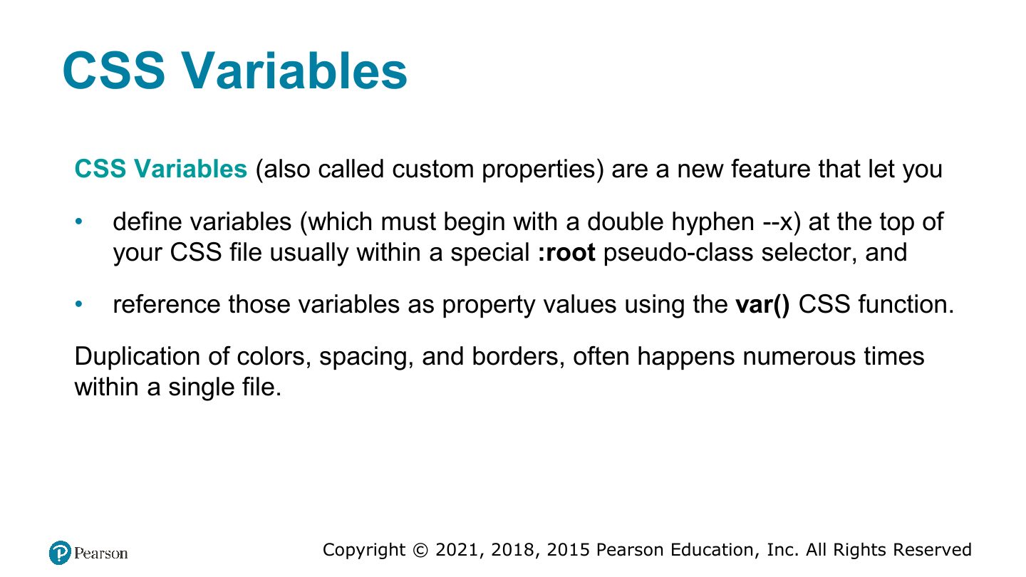
CSS Variables
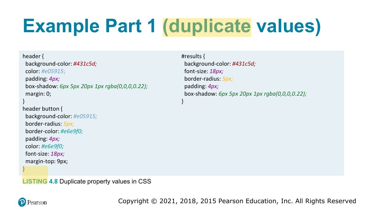
Example Part 1 (duplicate values)
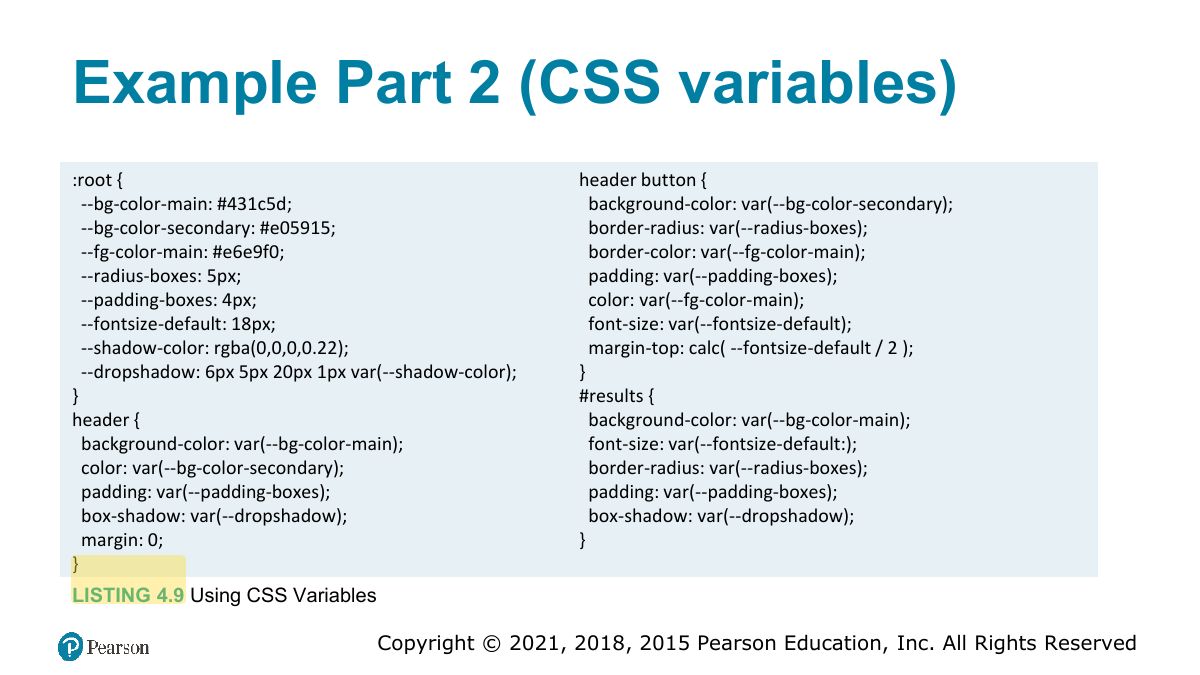
Example Part 2 (CSS variables)
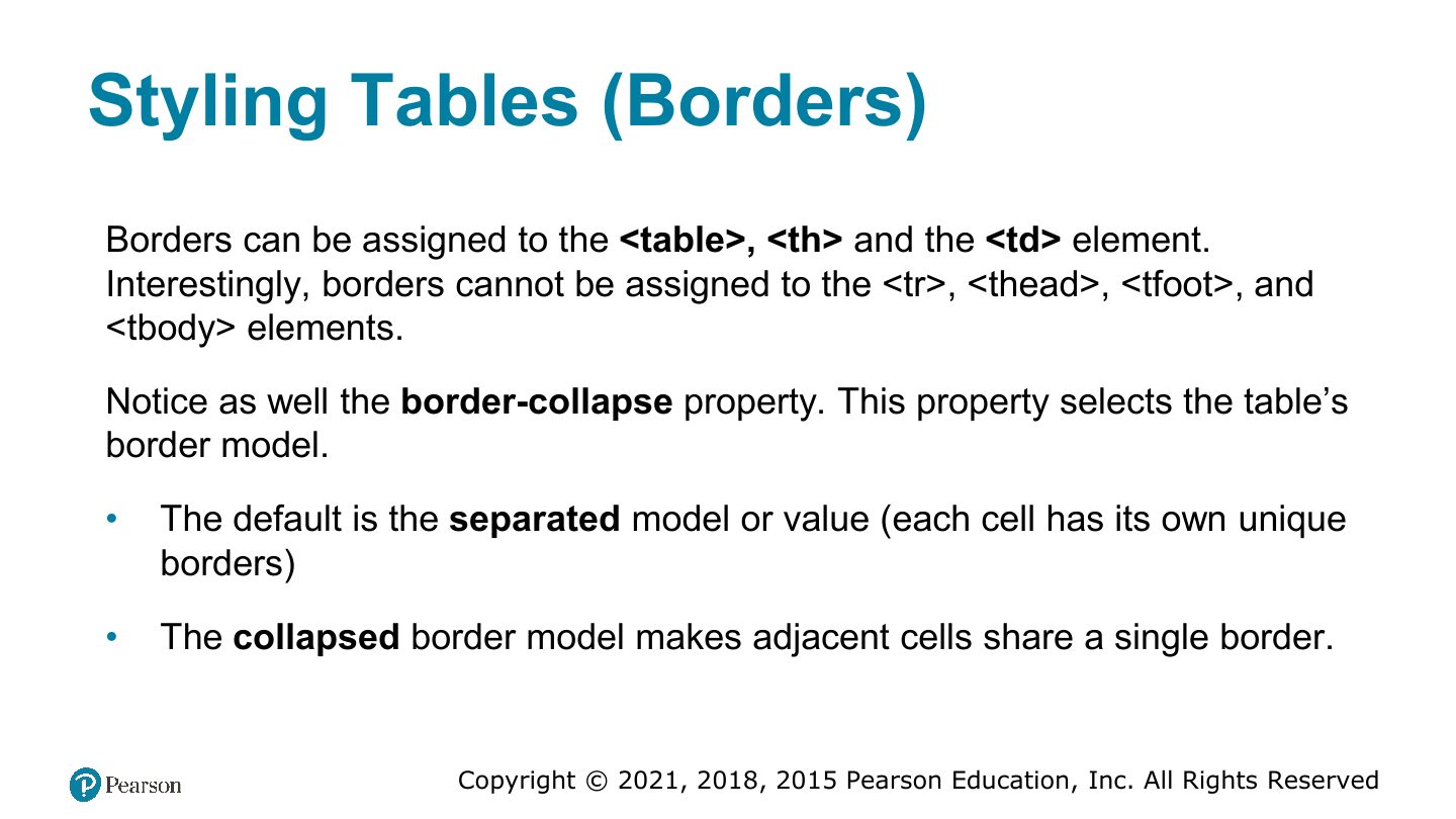
Styling Tables (Borders)
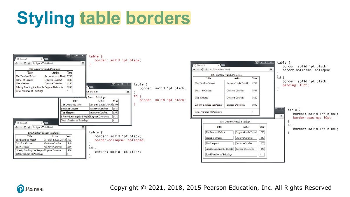
Styling table borders
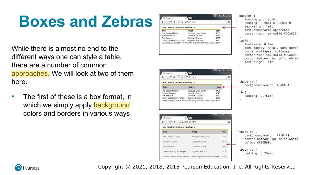
Boxes and Zebras
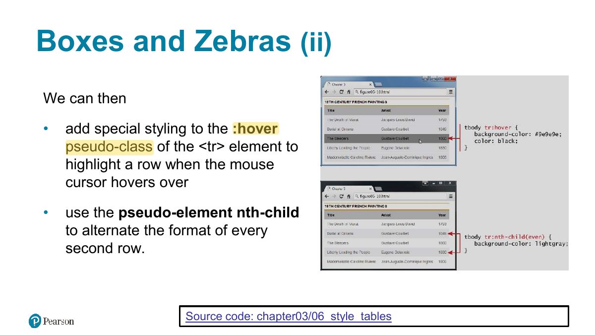
Boxes and Zebras (ii)
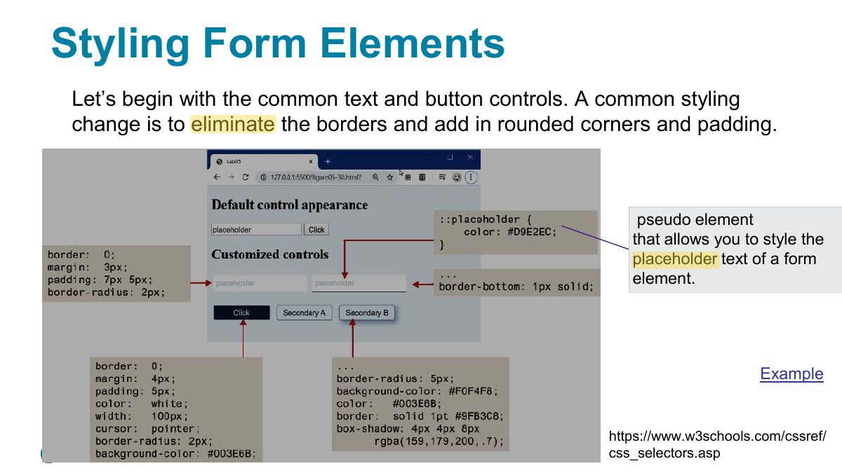
Styling Form Elements
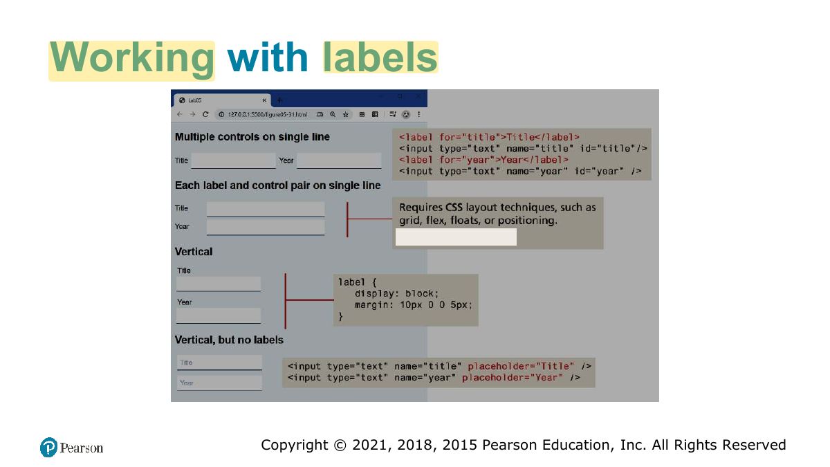
Working with labels
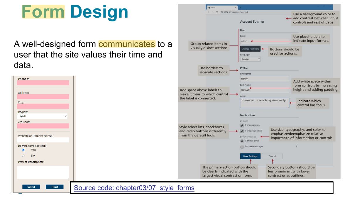
Form Design
Fundamentals of Web Development
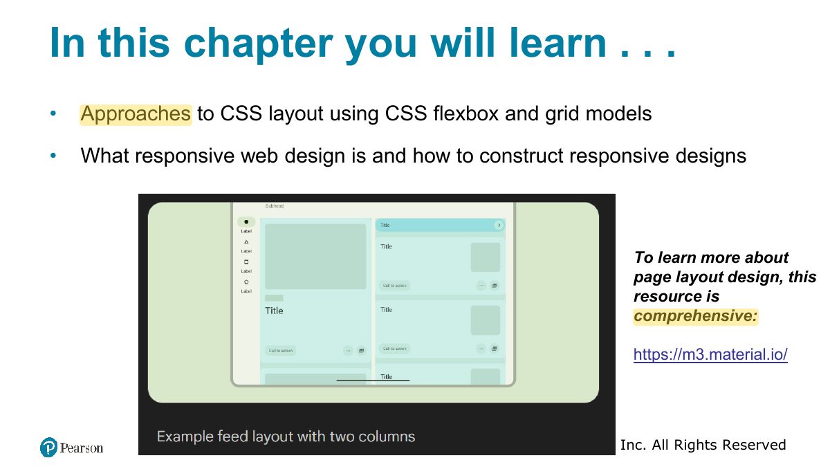
In this chapter you will learn . . .
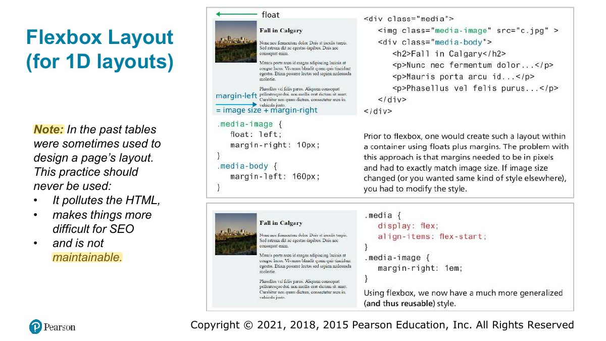
Flexbox Layout (for 1D layouts)
Notes
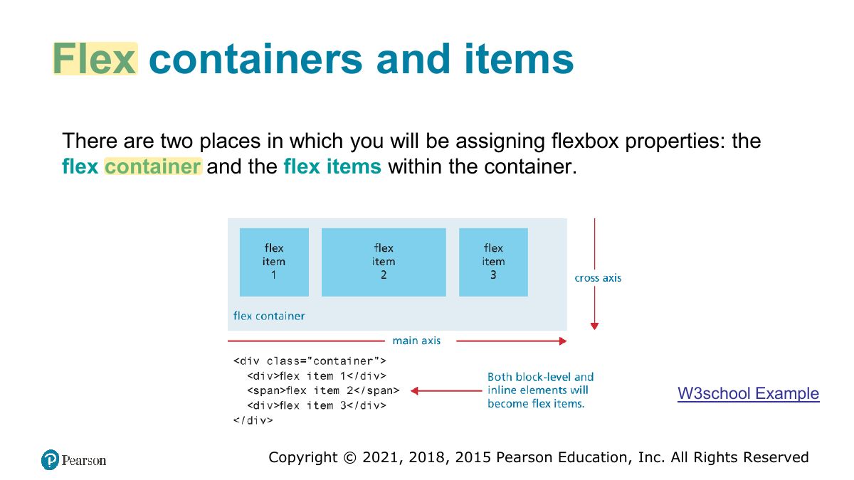
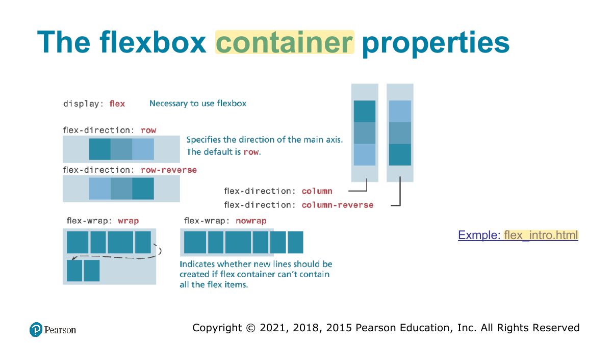
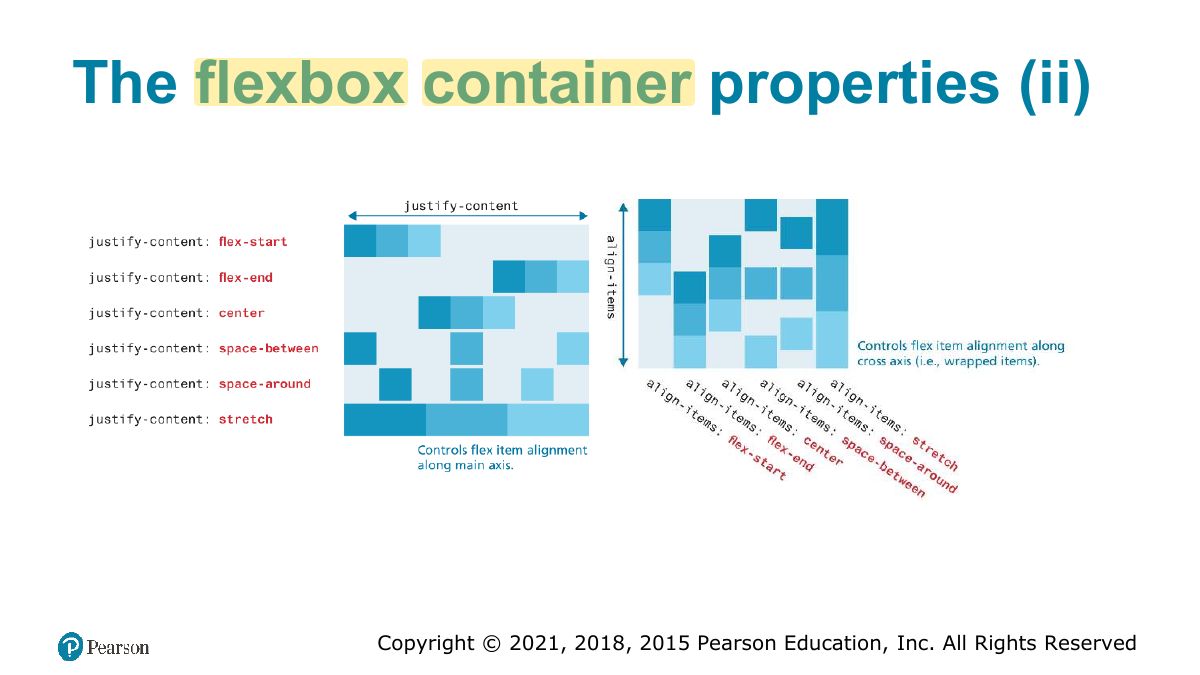
Flexbox: ONE-dimensional layout (a row or a column). Container: display: flex; justify-content (main axis), align-items (cross axis), flex-wrap, flex-direction.
Exam angle
In a flex row, which property aligns items horizontally along the main axis?
Flex containers and items
The flexbox container properties
The flexbox container properties (ii)
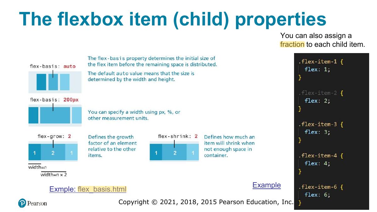
The flexbox item (child) properties
Grid Layout (for 2D layouts)
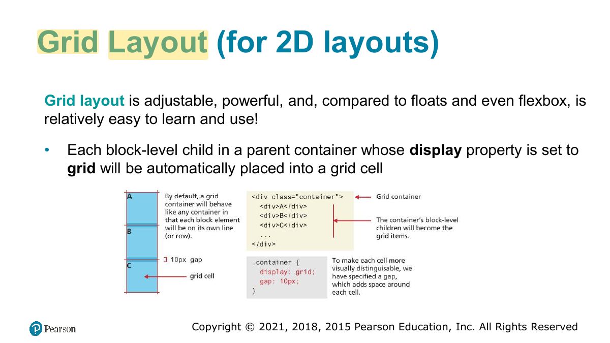
Notes
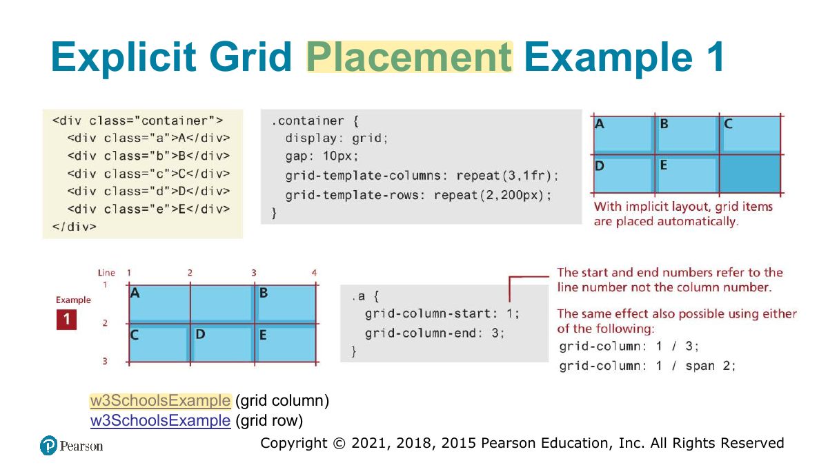
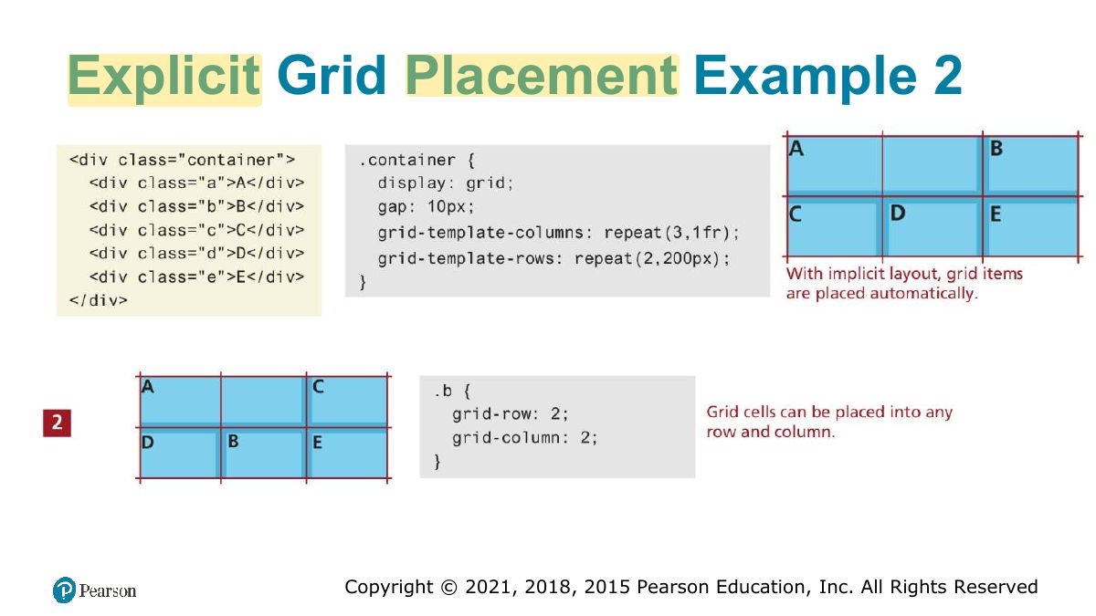
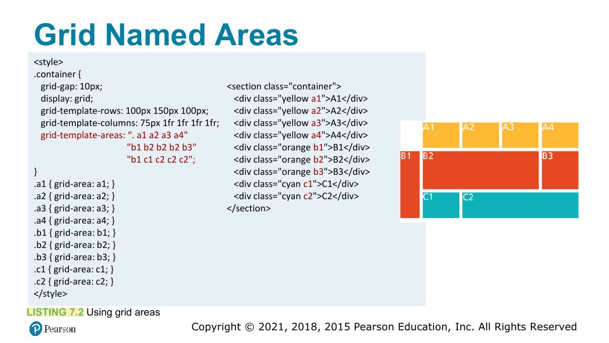
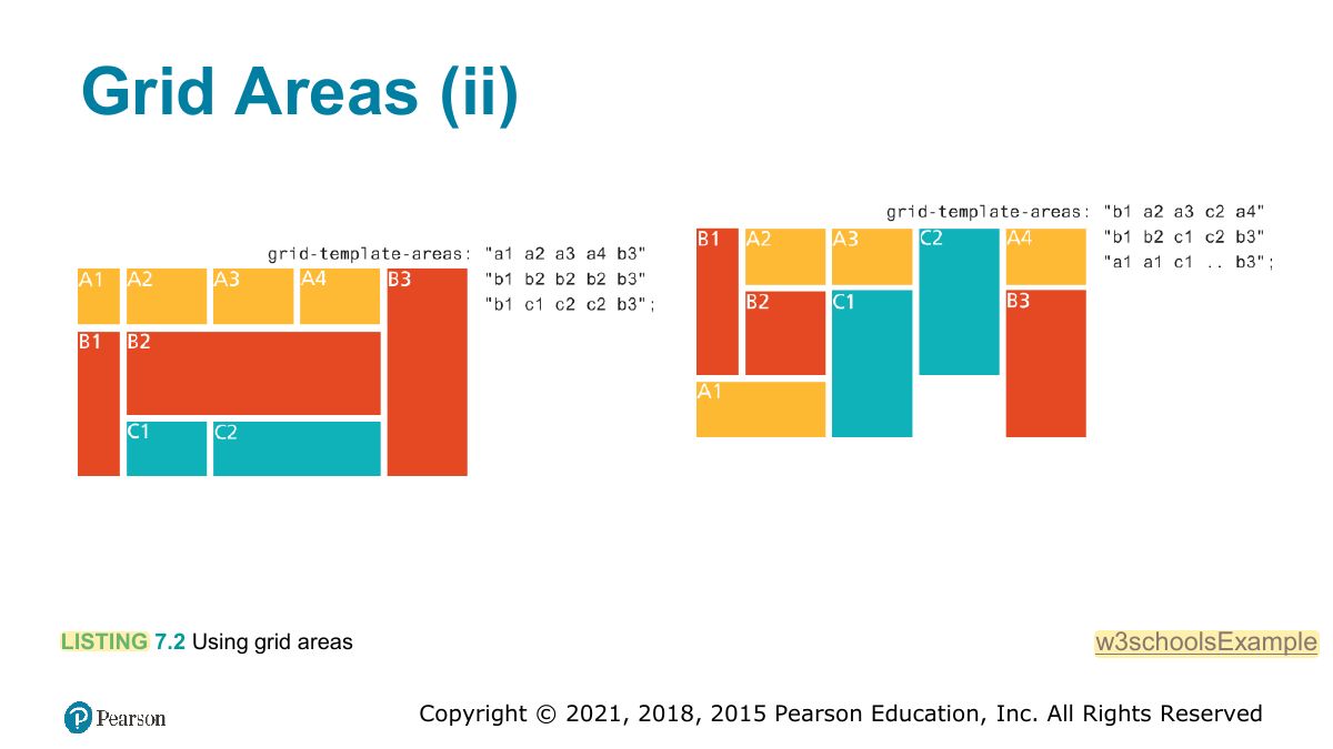
Grid: TWO-dimensional layout. grid-template-columns: 1fr 2fr; grid-column / grid-row placement; named areas.
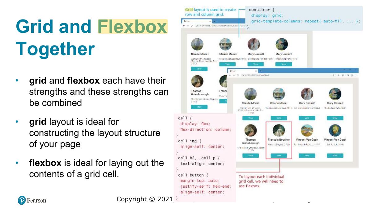
Memory trick Flexbox = 1D (row OR column). Grid = 2D (rows AND columns).
Specifying Grid Structure
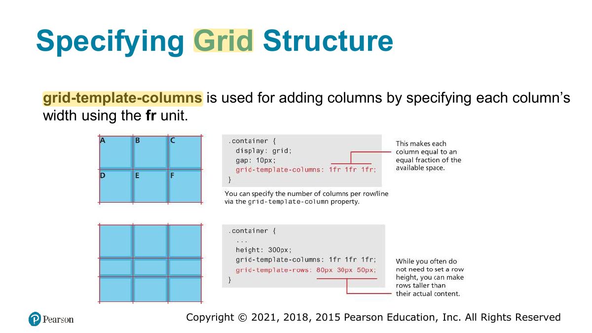
Specifying column widths
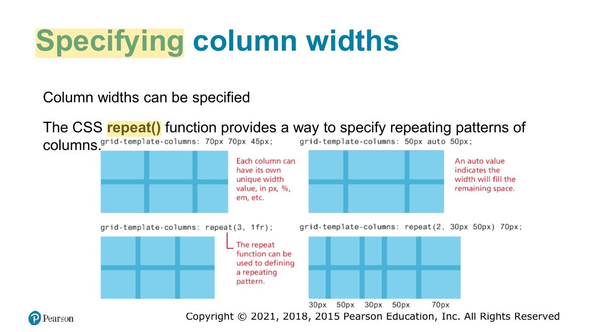
Specifying column widths (ii)
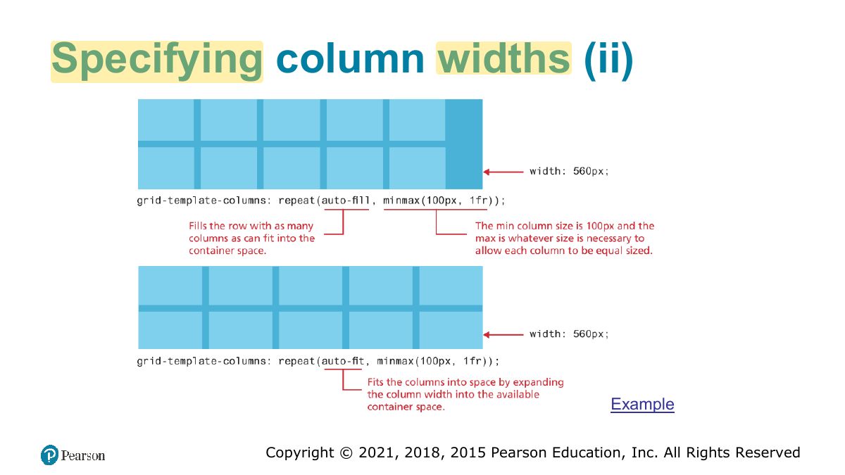
Explicit Grid Placement Example 1
Explicit Grid Placement Example 2
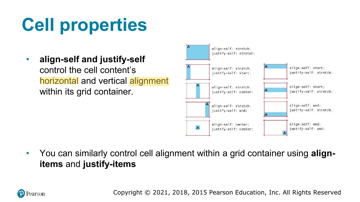
Cell properties
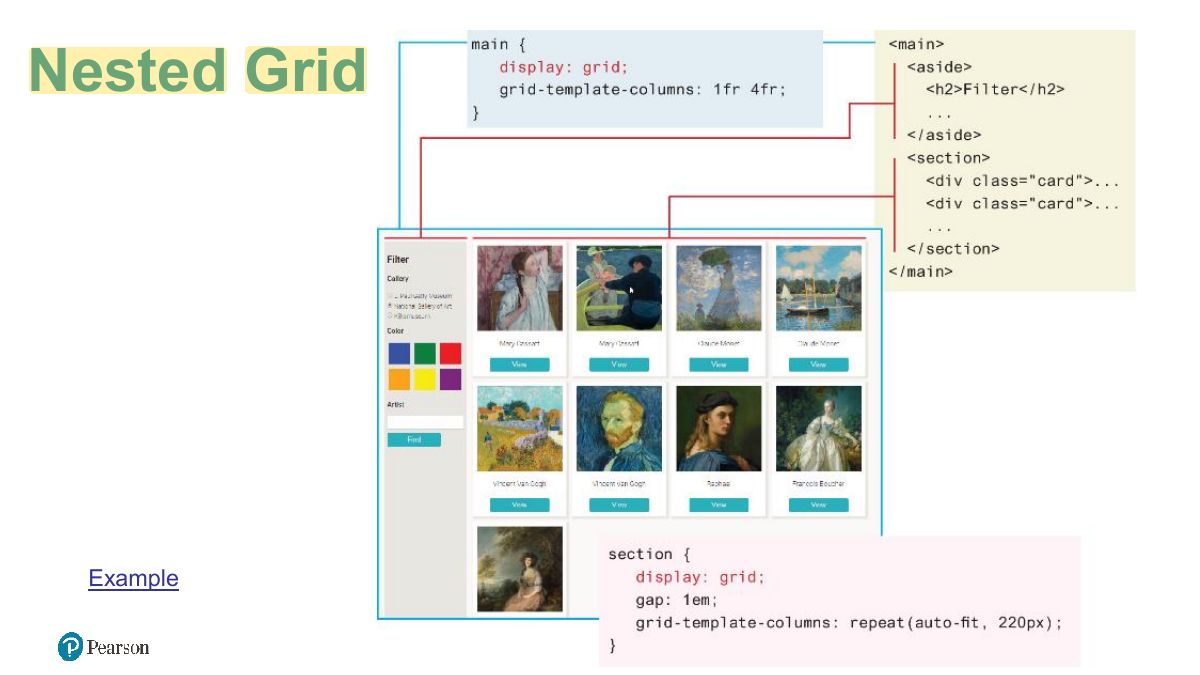
Nested Grid
Grid Named Areas
Grid Areas (ii)
Grid and Flexbox Together
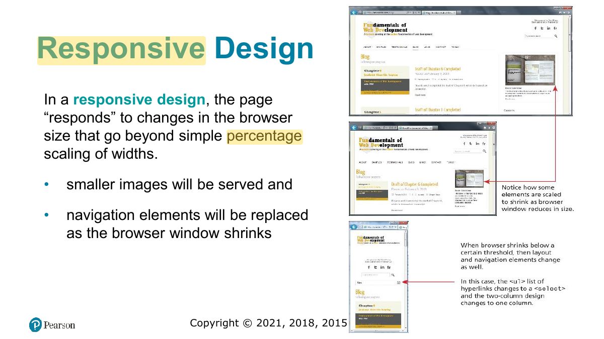
Responsive Design
Notes
Responsive design: layouts that adapt to screen size: fluid grids, flexible images, media queries.
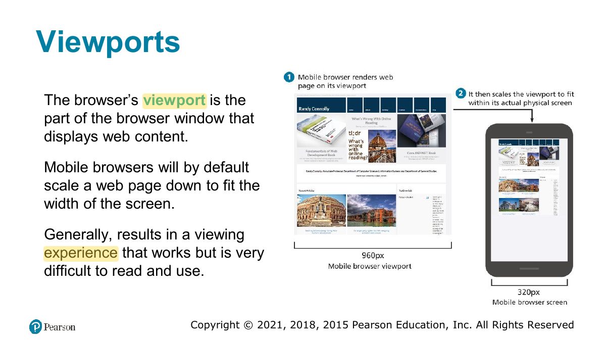
Viewports
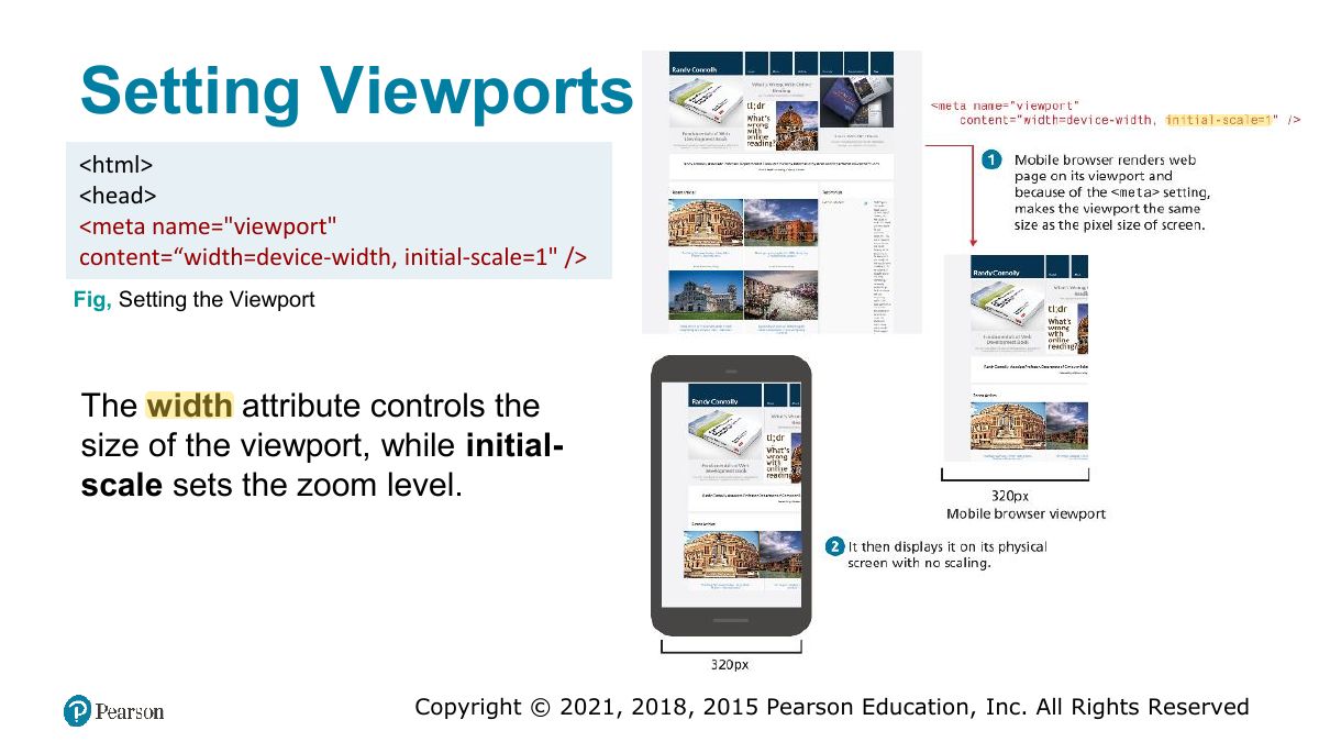
Setting Viewports
Notes
<meta name="viewport" content="width=device-width, initial-scale=1"> stops mobile browsers from zooming out a desktop layout.
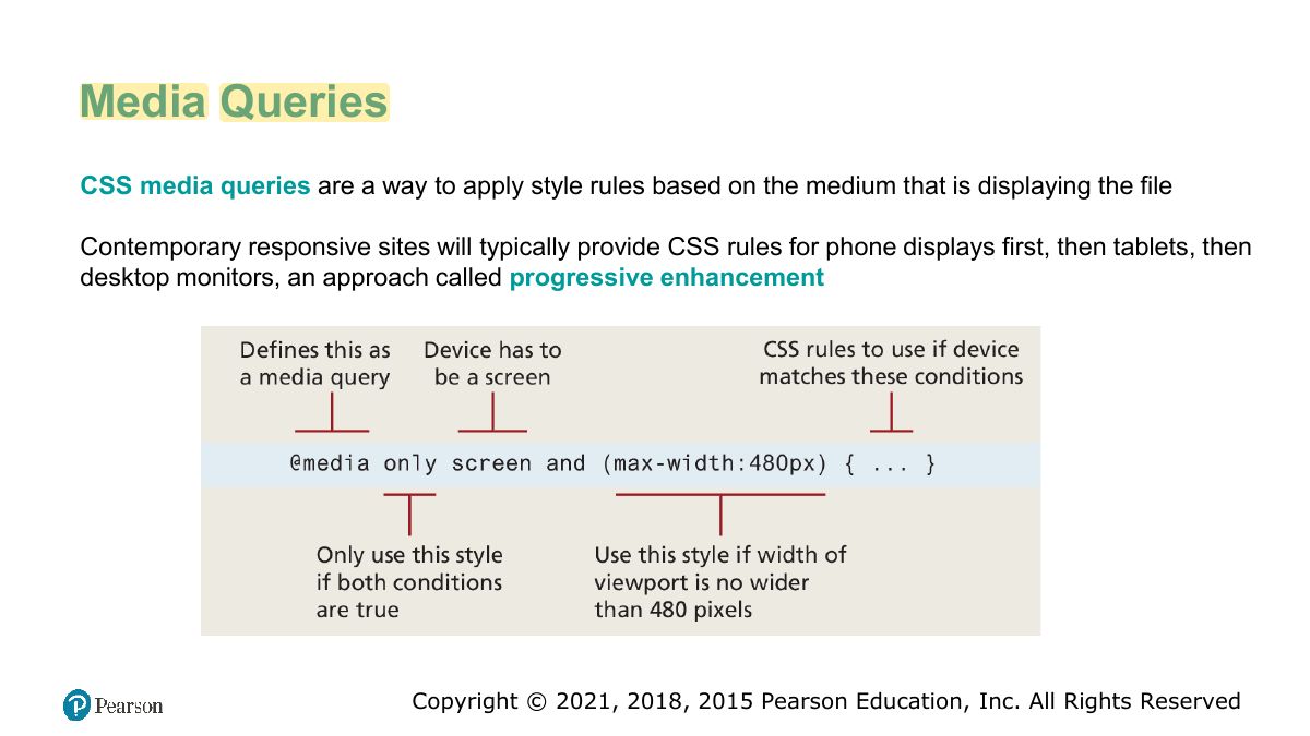
Media Queries
Notes
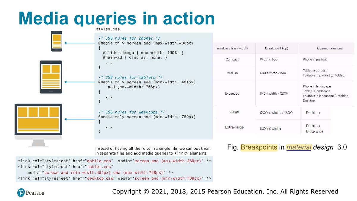
@media (max-width: 600px) { … } applies rules only when the condition is true.
Exam angle
Which applies styles only on screens 600px wide or less?
Media queries in action
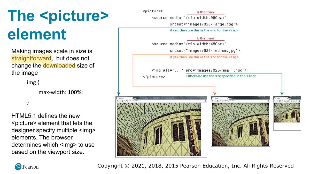
The <picture> element
Supporting Material